Popovers
Popovers are essentially a tiny overlay of content used for the demonstration of secondary information of components when they are linked to any particular u ...
Search Components
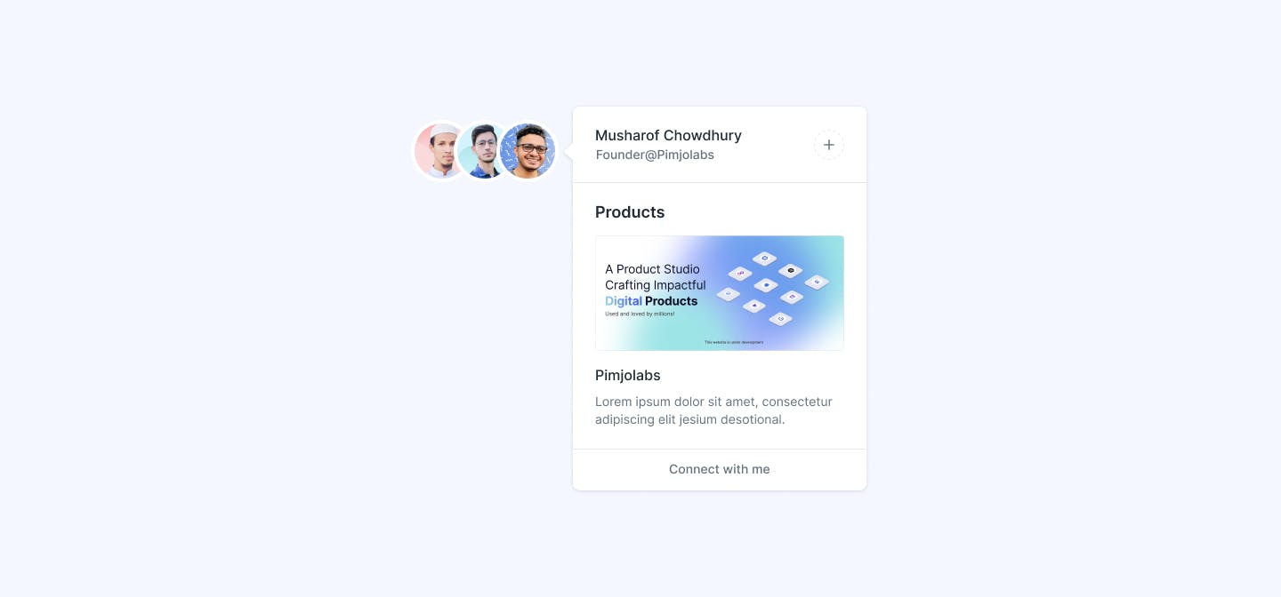
⌘KAvatar Popover
This component displays a popover containing information about a user upon hovering over their avatar. It includes the user's name, role, and a button for connecting with them. Additionally, it showcases a product image and description associated with the user.
Text Popover
This component showcases a popover triggered by hovering over a text link. When the user hovers over the text, a popover appears, displaying additional information. The popover contains a title and a description, offering users more context or details about the linked content.

Interactive Popover
This component features an interactive popover triggered by hovering over the "Popover Text" link. The popover contains a title, descriptive text, and two action buttons, "Yes" and "No." The popover appears next to the link, enhancing the visual connection between the trigger and the popover content.

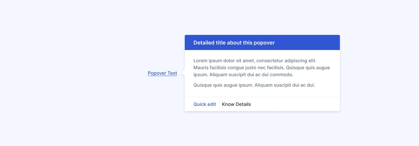
Detailed Popover
This component is an enhanced version of a popover that provides detailed information about a specific topic. When the user hovers over the "Popover Text" link, a popover appears with a background, containing a detailed title, descriptive text, and two action buttons: "Quick Edit" and "Know Details."
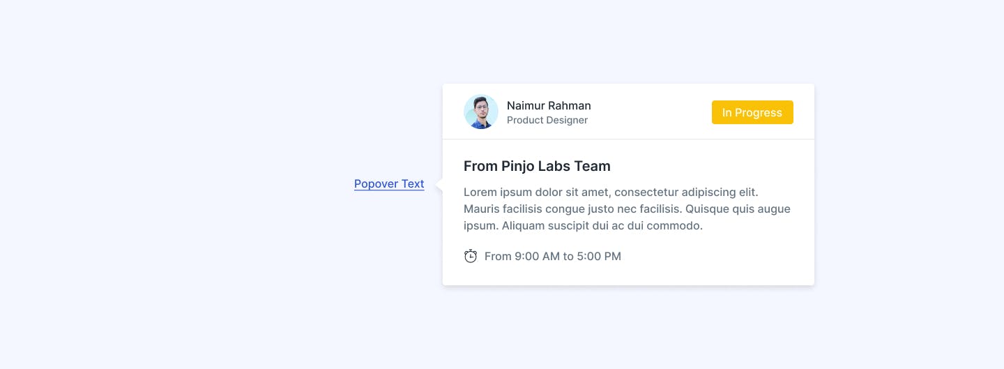
Team Member Popover
This component represents a popover that displays information about a team member. When the user hovers over the "Popover Text" link, a popover appears with a background, containing the team member's avatar, name, role, and status. Additionally, It also includes a message section and availability schedule.
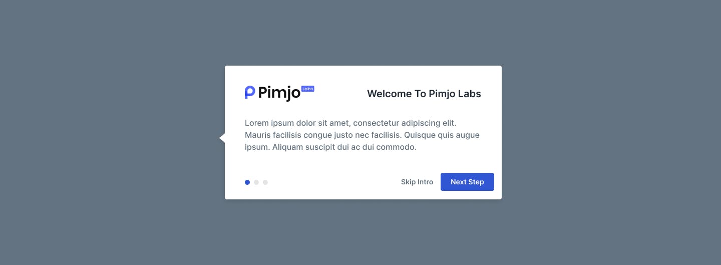
Welcome Guide Popover
This popover serves as an introduction to our platform. Triggered by hovering over the "Popover Text" link, it features a welcoming message, descriptive text, and navigation buttons for users to either skip the introduction or proceed to the next step. Its purpose is to warmly welcome users and guide them through introductory material.