Tailgrids React Components
Build faster with library of 100+ React components based on Tailwind CSS. Production-ready, fully customizable, and copy-paste friendly for React Tailwind projects. All components are free and open-source.
This page showcases all core Tailgrids components available today. Each component is designed to be production-ready, customizable, and easy to drop into real projects.
We're actively expanding the library with new components, examples and use-cases, so this list will continue to grow over time.
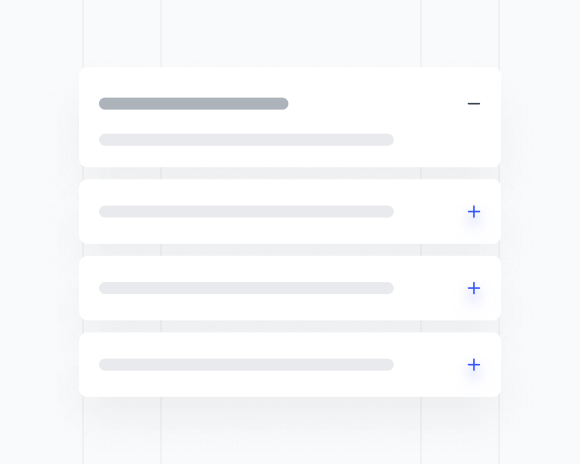
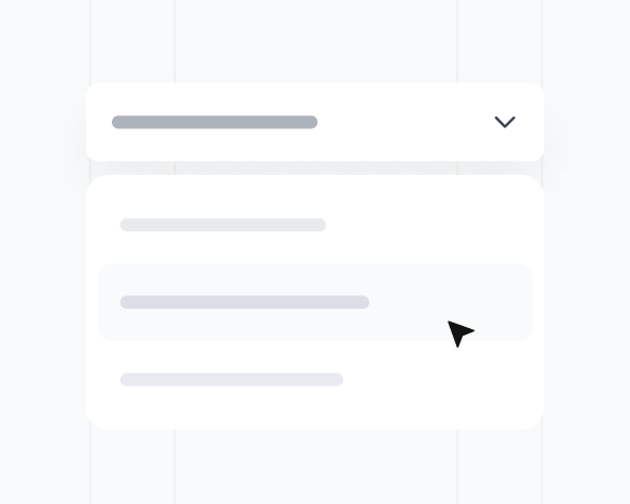
Accordion
6 Components
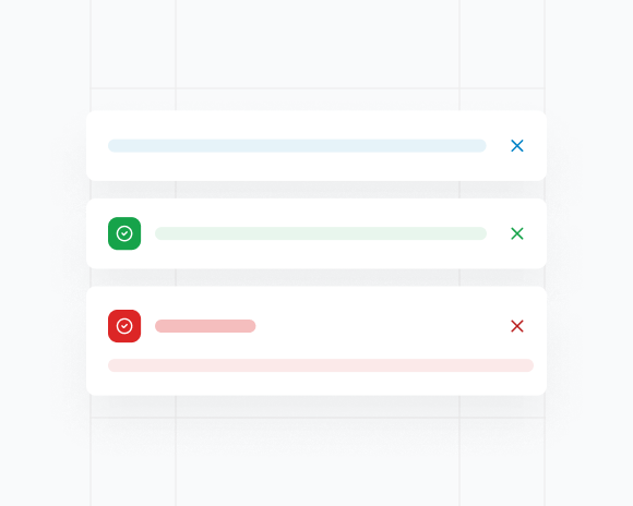
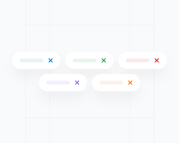
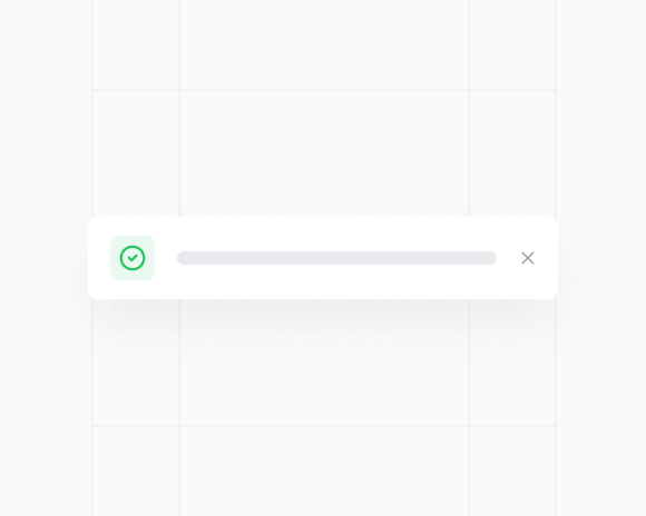
Alert
5 Components

Alert Dialog
3 Components
Aspect Ratio
3 Components
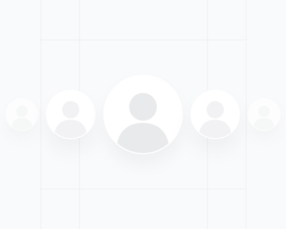
Avatar
6 Components
Badge
4 Components
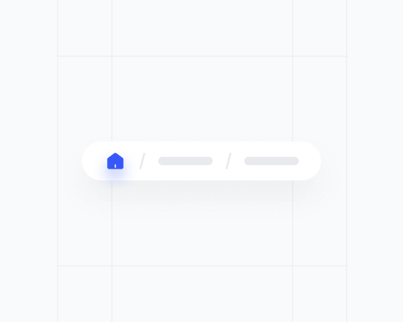
Breadcrumbs
2 Components
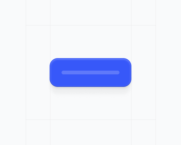
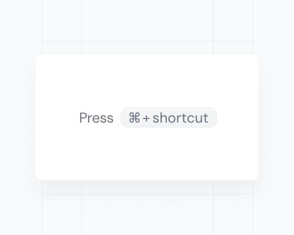
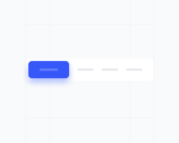
Button
6 Components

Button Group
3 Components

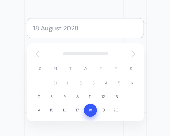
Calendar
8 Components
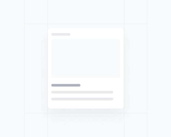
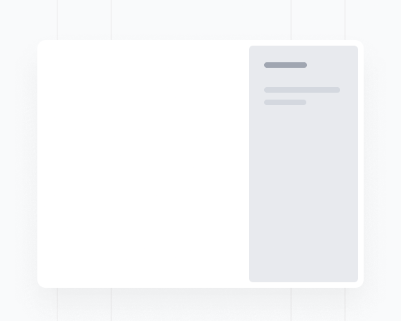
Card
7 Components
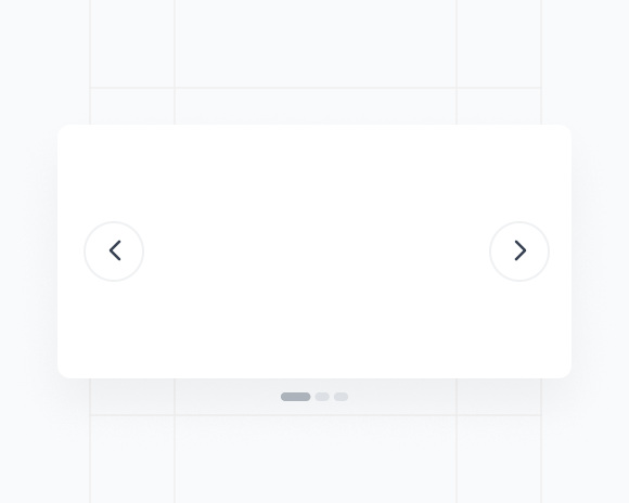
Carousel
5 Components
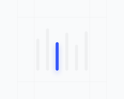
Chart
5 Components

Checkbox
3 Components
Collapsible
6 Components
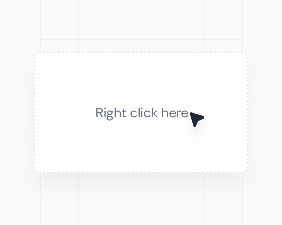
Context Menu
3 Components
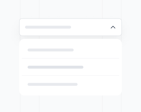
Combobox
10 Components
Command
3 Components
Date Field
9 Components
Date Picker
11 Components
Description
2 Components
Dialog
9 Components
Drawer
4 Components
Dropdown
4 Components
Field
5 Components
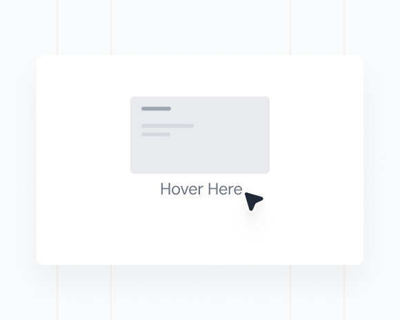
Hover Card
4 Components
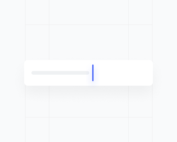
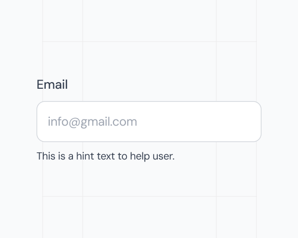
Input
6 Components
Input Group
4 Components
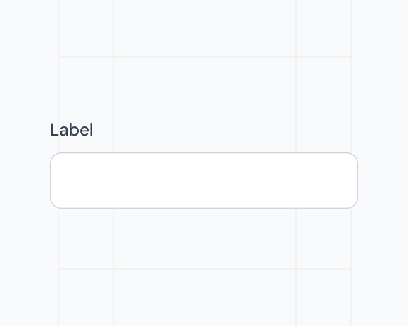
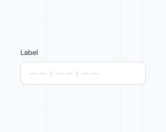
Label
2 Components

Link
4 Components
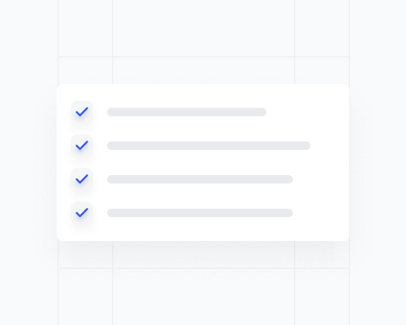
List
9 Components
Menubar
4 Components
Native Select
4 Components
Navigation Menu
3 Components
Number Field
9 Components
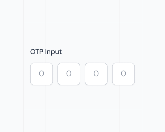
OTP Input
5 Components
Overlay
3 Components
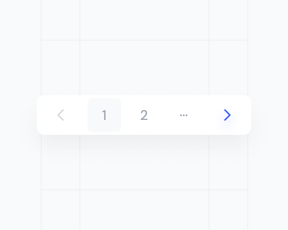
Pagination
5 Components

Popover
4 Components
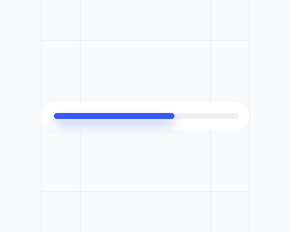
Progress
3 Components
Radio Input
7 Components
Range Calendar
9 Components
Resizable
3 Components
Scroll Area
3 Components
Select
9 Components
Separator
1 Component
Sheet
4 Components
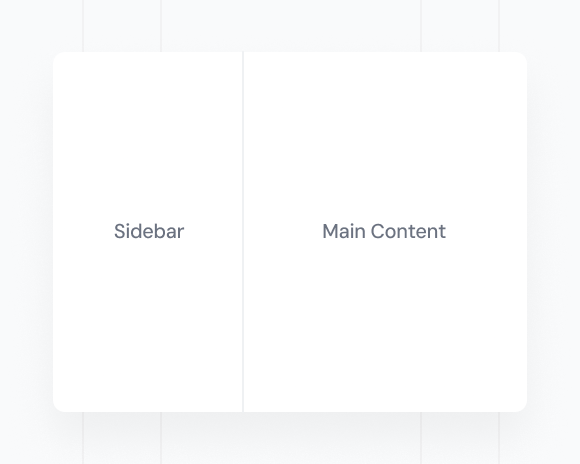
Sidebar
4 Components

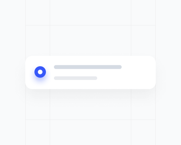
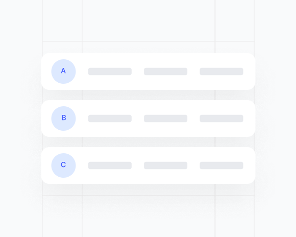
Skeleton
9 Components
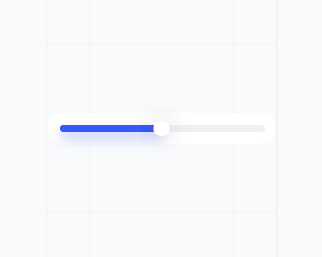
Slider
5 Components
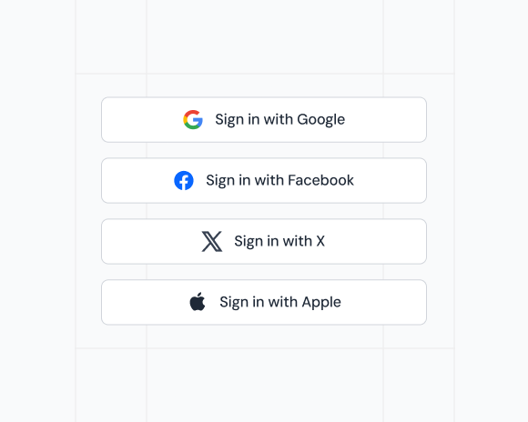
Social Button
3 Components
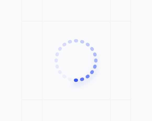
Spinner
4 Components
Table
4 Components
Tabs
5 Components
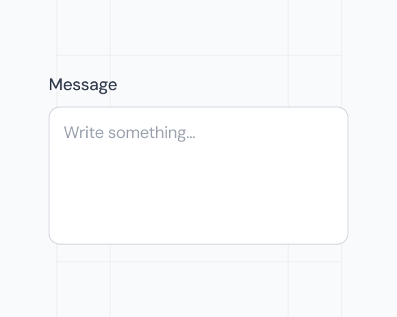
Text Area
7 Components
Text Field
5 Components
Time Field
7 Components
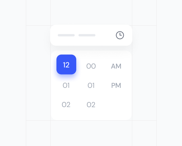
Time Picker
3 Components
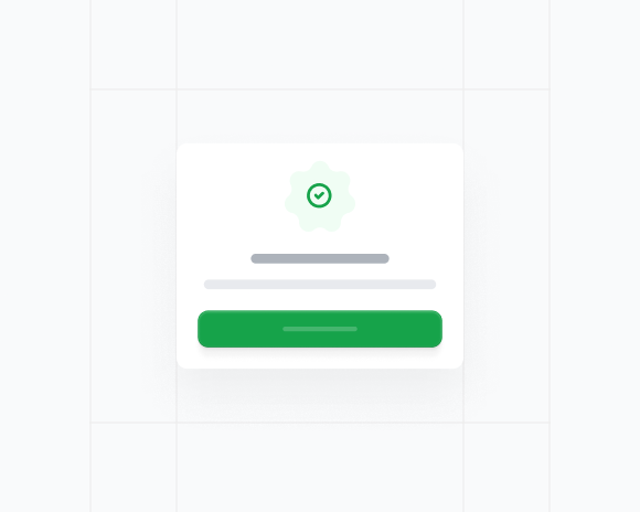
Toast
5 Components
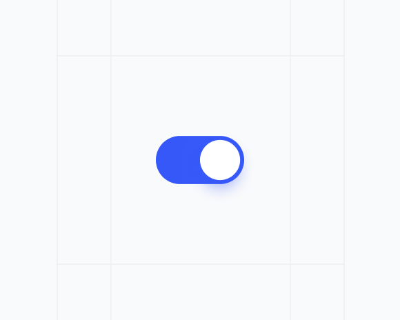
Toggle
3 Components
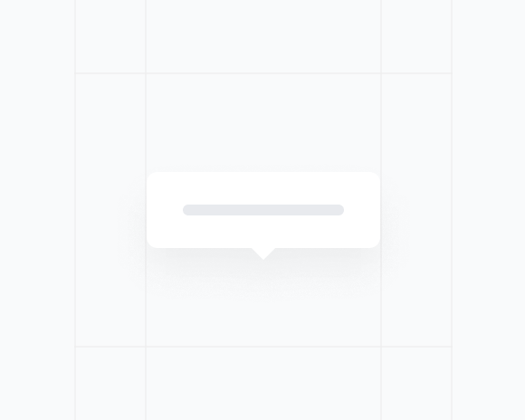
Tooltip
3 Components
