Charts
Charts and graphs are the best way to synthesise any given information. There are various types of charts that you can use in your Dashboard. They can be bar ...
Search Components
⌘KLine Chart with Data Points
A line chart component that displays two datasets ("Product One" and "Product Two") over time. The chart features a dropdown menu for selecting a timeframe (monthly or yearly) and distinct data points for each product at different time intervals.
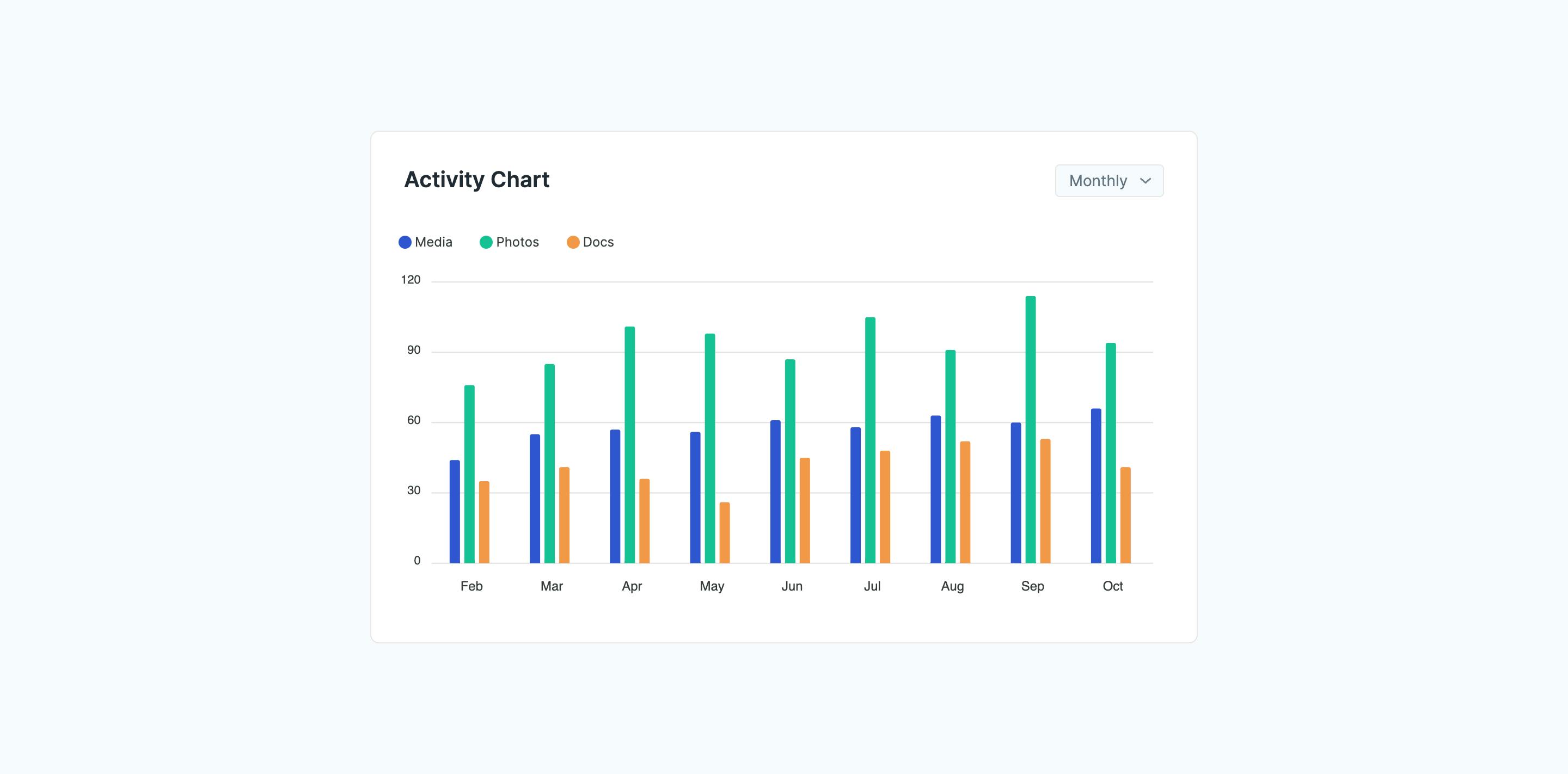
Bar Chart with Category Labels
A bar chart component designed to compare different categories over a timeframe (monthly or yearly). The chart features colored bars for each category, with the y-axis indicating quantity or value. A dropdown menu allows users to easily switch between different time periods.
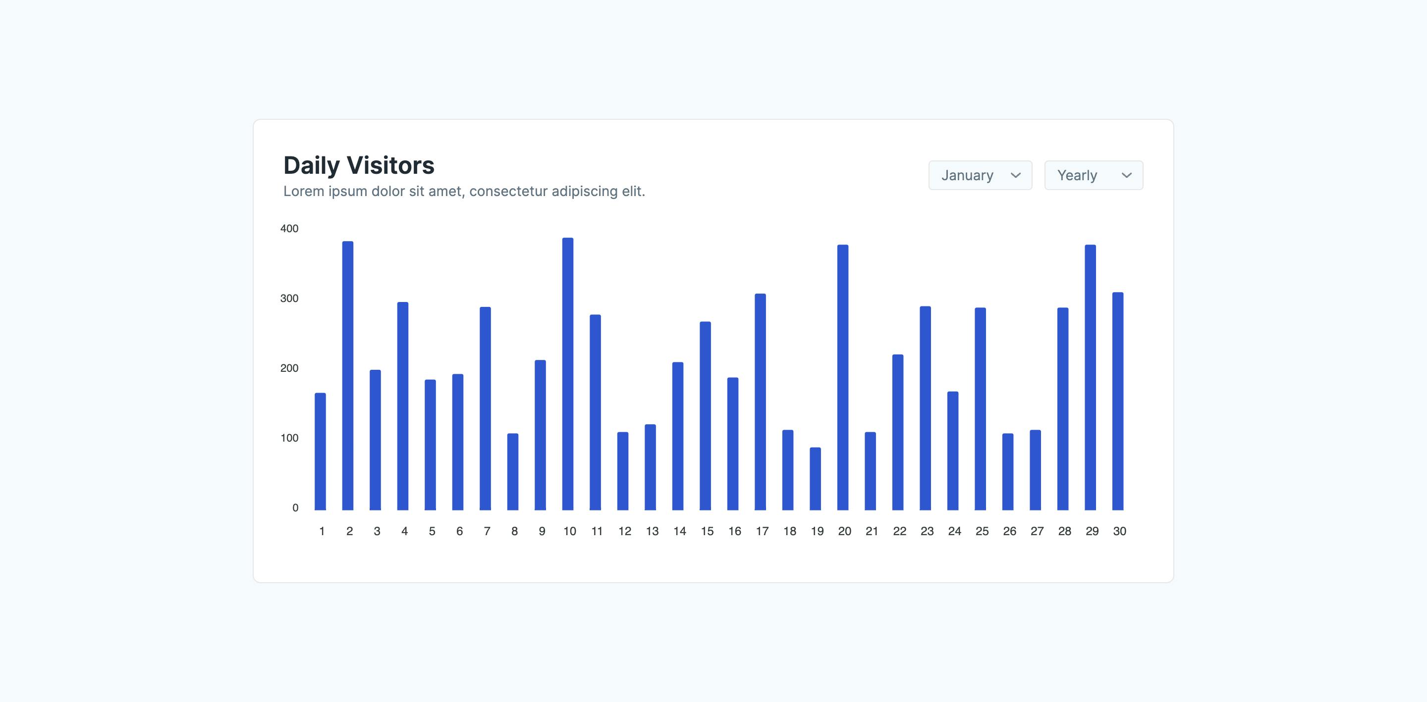
Daily Visitor Bar Chart with Monthly/Yearly View
This is a bar chart component designed to visualize daily website visitor trends. The style allows users to toggle between monthly and yearly views, providing a flexible way to analyze website traffic data.
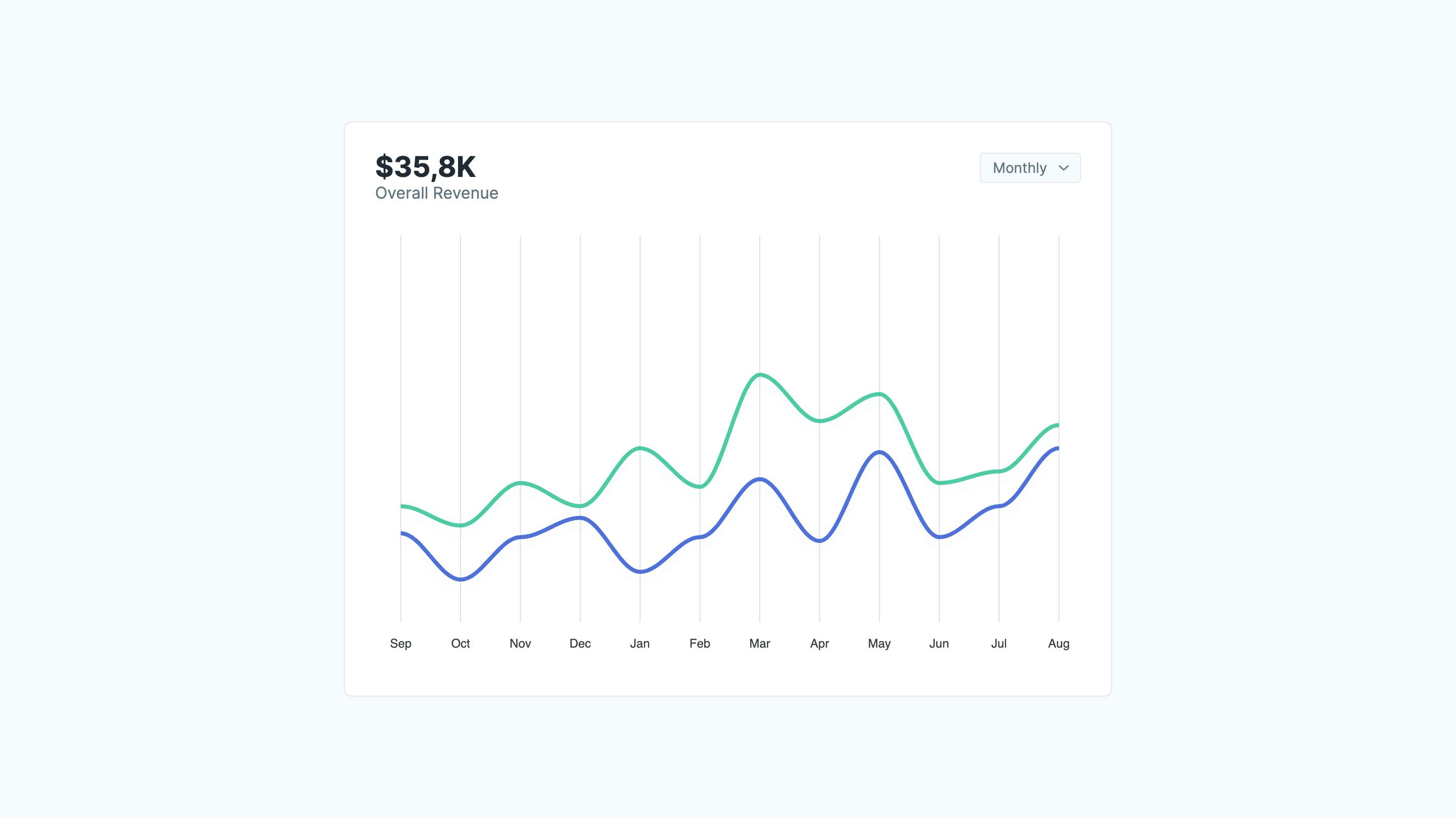
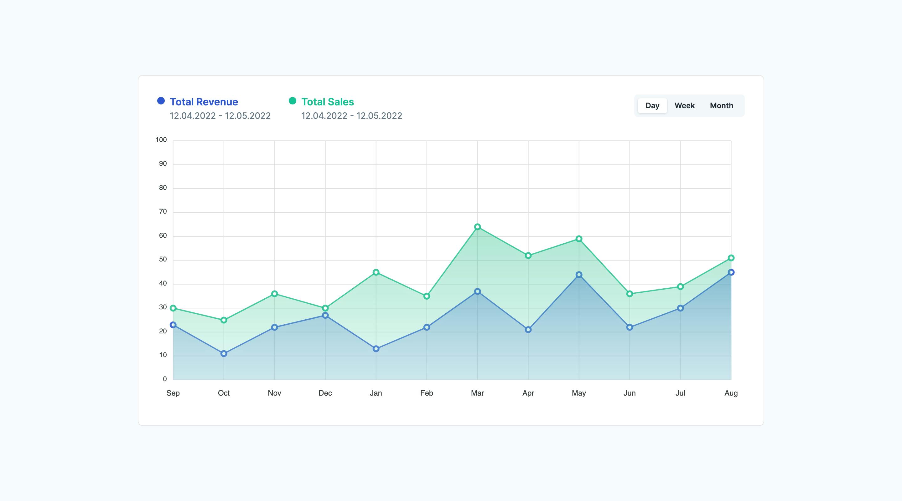
Multi-Line Area Chart with Time Period Toggle
This chart visualizes revenue and sales data over time. It displays multiple data series as colored areas with marked data points, allowing for easy comparison. A button group at the top right enables users to toggle between daily, weekly, or monthly views.
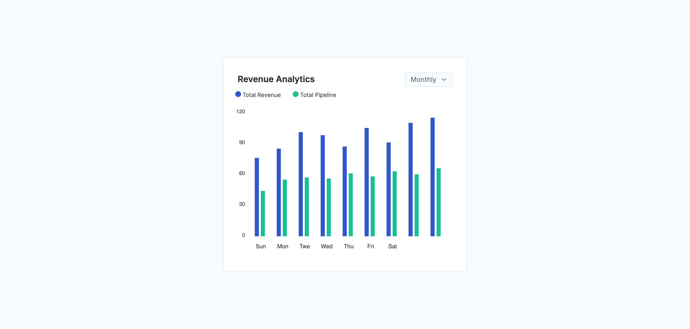
Bar Chart with Monthly/Yearly Toggle
A bar chart component is designed to visualize data comparisons over time. It displays two data series as colored bars, with the y-axis indicating quantity or value. A dropdown menu lets users switch monthly and yearly views to analyze trends.
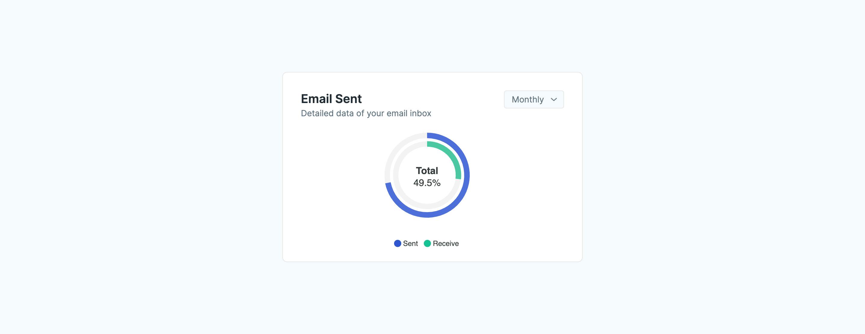
Radial Bar Chart
This is a radial bar chart component that visually compares the number of emails sent versus received. This style allows users to quickly grasp the relative proportions of each category, providing a clear overview of email activity within a specified timeframe (monthly or yearly via a dropdown menu).
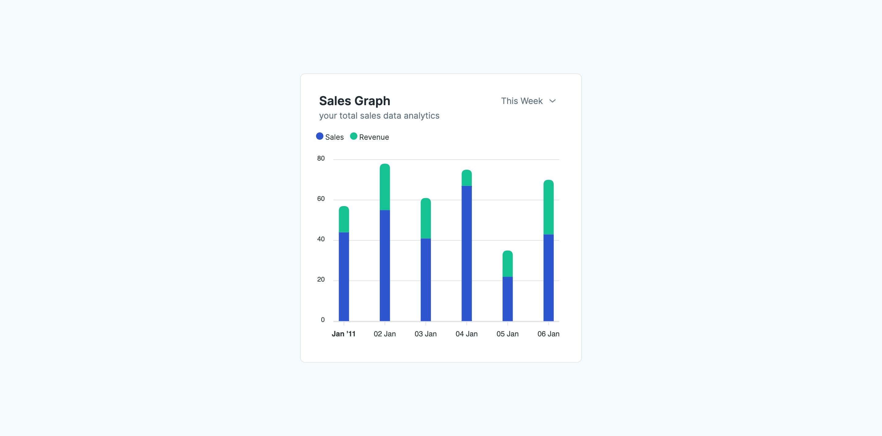
Stacked Bar Chart for Sales
A stacked bar chart designed to display sales data over time, with separate bars for "Sales" and "Revenue." The chart features a dropdown menu to toggle between monthly and yearly views, allowing users to analyze trends and compare data across different timeframes.
Radial Storage Usage Gauge with Label
A radial gauge chart designed to visualize storage usage. This component displays the percentage of used storage and includes a label indicating the amount of available storage remaining. It also features a "Clean" button, presumably for clearing or freeing up storage space.

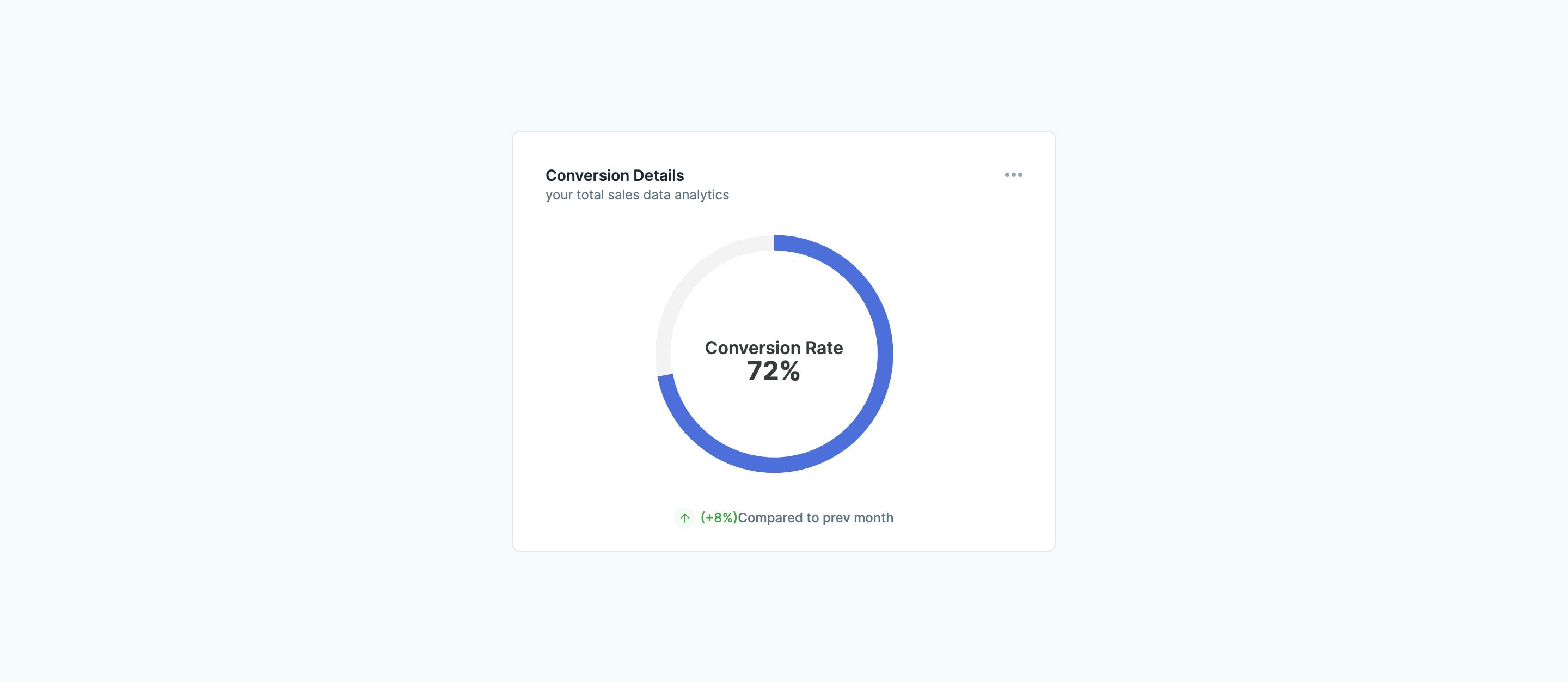
Conversion Rate Gauge
This is a radial gauge chart displaying the conversion rate compared to the previous month. The chart is accompanied by a text label indicating a positive or negative change from the previous month.
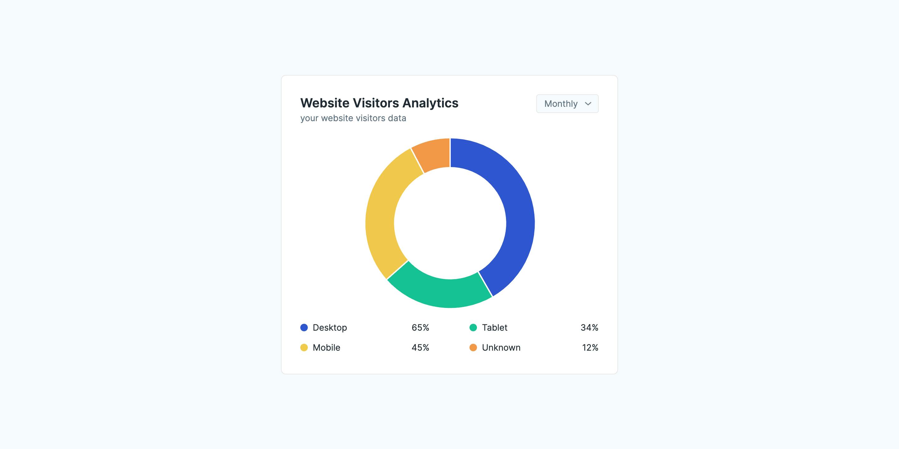
Website Visitor Analytics Donut Chart
A visually appealing donut chart is designed to showcase website visitors' distribution by device type (desktop, tablet, mobile, unknown). It provides a clear percentage breakdown of each category, allowing for easy analysis of user device preferences.