Table
React Table components are used to display structured data in rows and columns. They are commonly used for lists, reports, dashboards, admin panels, and data-heavy interfaces where content needs to be easy to scan and compare.
This Table component is built with React and styled using Tailwind CSS. It provides composable table parts, responsive horizontal scrolling, and flexible styling while keeping native table semantics.
| Product | Price | Stock |
|---|---|---|
| Laptop | $999 | |
| Mouse | $29.99 | |
| Keyboard | $79.99 |
Installation
Install the component using the Tailgrids CLI.
npx @tailgrids/cli add tableAnatomy
Import the table parts and compose them to build the layout.
import {
  TableRoot,
  TableHeader,
  TableBody,
  TableHead,
  TableRow,
  TableCell
} from "@/components/tailgrids/core/table";

const TablePreview = () => (
  <TableRoot>
    <TableHeader>
      <TableRow>
        <TableHead />
      </TableRow>
    </TableHeader>
    <TableBody>
      <TableRow>
        <TableCell />
      </TableRow>
    </TableBody>
  </TableRoot>
);

export default TablePreview;
Usage
import {
  TableRoot,
  TableHeader,
  TableBody,
  TableHead,
  TableRow,
  TableCell
} from "@/components/tailgrids/core/table";

export default function TableExample() {
  return (
    <TableRoot>
      <TableHeader>
        <TableRow>
          <TableHead>Header</TableHead>
        </TableRow>
      </TableHeader>
      <TableBody>
        <TableRow>
          <TableCell>Cell</TableCell>
        </TableRow>
      </TableBody>
    </TableRoot>
  );
}
Examples
Full Bleed
The fullBleed prop removes rounded corners and side borders, making the table span the full width of its container. This is useful for edge-to-edge layouts.
| Product | Price | Stock |
|---|---|---|
| Laptop | $999 | |
| Mouse | $29.99 | |
| Keyboard | $79.99 |
Recent Orders
A dashboard widget style table for displaying recent orders with product thumbnails and "See All" navigation.
Recent Orders
| Products | Category | Date | Price | Status |
|---|---|---|---|---|
 Macbook pro 13” 2 Variants | Laptop | Nov 23, 01:00 PM | $2399.00 | |
 Apple Watch Ultra 1 Variants | Watch | Nov 22, 09:00 PM | $879.00 | |
 iPhone 15 Pro Max 2 Variants | Smart Phone | Oct 12, 03:54 PM | $1869.00 | |
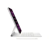 iPad Pro 3rd Gen 2 Variants | Electronics | Sep 09, 02:00 AM | $1699.00 | |
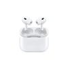 Airpods Pro 2nd Gen 1 Variants | Accessories | Feb 35, 08:00 PM | $240.00 |
Order History
An order history table that displays order status with color-coded badges and includes a sorting interface.
Order History
Review all your past purchases in one convenient place.
| Order ID | Customer Name | Product | Amount | Status | Order Date |
|---|---|---|---|---|---|
| #ORD-10245 | Musharof Chowdhury | Noise Buds Pro | $79.99 | 2025-03-11 | |
| #ORD-10246 | Johurul Haque | MacBook Air M2 | $1,199 | 2025-03-18 | |
| #ORD-10247 | Ahmed Faisal | Dell XPS 13 | $999 | 2025-02-27 | |
| #ORD-10248 | Ahmed Tusar | Apple Watch SE | $249 | 2025-04-01 |
Transactions
A financial transactions table including category icons, price formatting, and status indicators.
Latest Transactions
| Name | Date | Price | Category | Status | |
|---|---|---|---|---|---|
P Bought PYPL | Nov 23, 01:00 PM | $2,567.88 | Finance | ||
A Bought AAPL | Nov 22, 09:00 PM | $3,987.45 | Technology | ||
K Sell KKST | Oct 12, 03:54 PM | $6,754.99 | Finance | ||
f Bought FB | Sep 09, 02:00 AM | $1,445.41 | Social media | ||
a Sell AMZN | Feb 05, 08:00 PM | $5,698.55 | E-commerce |
API Reference
TableRoot
Wraps the entire table and manages layout and overflow behavior. Extends native table element props.
| Prop | Type | Default | Description |
|---|---|---|---|
fullBleed | boolean | false | Remove rounded corners for edge-to-edge layout |
className | string | - | Additional CSS classes |
TableHeader
The table header container. Extends thead element props.
| Prop | Type | Description |
|---|---|---|
className | string | Additional CSS classes |
TableBody
The table body container. Extends tbody element props.
| Prop | Type | Description |
|---|---|---|
className | string | Additional CSS classes |
TableHead
A table header cell. Extends th element props.
| Prop | Type | Description |
|---|---|---|
className | string | Additional CSS classes |
TableRow
A table row. Extends tr element props.
| Prop | Type | Description |
|---|---|---|
className | string | Additional CSS classes |
TableCell
A table data cell. Extends td element props.
| Prop | Type | Description |
|---|---|---|
className | string | Additional CSS classes |
Accessibility
- Uses native table elements (
table,thead,tbody,tr,th,td) - Header cells use
<th>for proper screen reader context - Left-aligned text for better readability
- Horizontal scroll container for responsive behavior
- Supports all standard table HTML attributes
