Hero UI Alternatives: 7+ React UI Libraries To Use in 2026
Explore the best Hero UI alternatives for React developers. Compare features, customization, accessibility, and performance in 2026.
Sumaiya Afrin Kanak
24 Jun 2026
You are building a brand-new project, installing Hero UI, thinking it will make everything easier. Then you go for the customization, and it hits you. You don’t have ownership of the code, and a highly dependent architecture doesn’t let you add other libraries. The Hero UI alternatives solve all these problems.
Developers now don’t get stuck on one problem. They explore alternatives and find the one that best meets their needs. The other Hero UI competitors give them the freedom. The libraries offer full flexibility, ownership, and customization.
In this guide, we will explore the 7+ best Hero UI alternatives for 2026. You will find their strengths and what they are best suited for. So, you don’t have to waste hours looking and testing for the perfect UI library for your next project.
What is Hero UI?
Hero UI is a popular open-source React component library. Developers love it for the AI-first approach. You can build apps with just a few prompts, too. Also, it is built on top of Tailwind CSS and React Aria. So, you can easily build modern and engaging UI designs. Not only that, the library has zero boilerplate strategy. So, you don’t need to stack the whole application in a tag.
In addition, Hero UI offers 70+ production-ready, accessible UI components. The components look very polished. Thus, it fits any modern design requirements. Another advantage of that, the component library offers cross-platform support. Hence, you can work with React, Vite, Remix, and React Native as well.
What Hero UI Lacks?
Hero UI lacks complex customization and native advanced components. So, you can build simple and engaging applications, but you will struggle with the stronger ones. That’s the reason developers are now choosing the Hero UI competitors. Here are the reasons developers are choosing Hero UI alternatives:
- Don’t give developers full code ownership. So, you can not change or customize a component from the ground up.
- Hero UI has a polished component style. Thus, large organizations face limitations in building a custom interface.
- For highly custom dashboard templates or SaaS boilerplates, developers don’t get control over every detail of the design.
- Hero UI is a great library for small apps, such as productivity tools. But for large SaaS apps, the alternatives work and offer better features.
Higher Dependency Footprint
Hero UI has pre-built components, theming features, and accessibility components. Also, it creates small apps with just prompts. So new developers sometimes rely heavily on the system. In this way, they really suffer from the higher dependency footprint. Also, they have very few customization options and limited ways to create a unique brand presence.
Best Alternatives to Hero UI - At a Glance
| UI Library | Best For | Tailwind Support | Accessibility | Key Strength | Limitation |
| Tailgrids UI | Scalable SaaS and enterprise apps | Yes | Good | Huge component library and full design control | Needs Tailwind expertise |
| Shadcn UI | Custom design systems and modern apps | Yes | Excellent | Full code ownership and highly flexible setup | Requires manual setup and maintenance |
| Material UI | Enterprise and production apps | Partial | Excellent | Mature ecosystem and strong documentation | Can feel heavy and opinionated |
| Chakra UI | SaaS dashboards and fast development | Partial | Excellent | Simple API and accessibility-first design | Limited advanced components |
| Ant Design | Data-heavy enterprise systems | Partial | Good | Powerful data components and design system | Less flexible for unique branding |
| Radix UI | Custom UI foundations | Yes | Excellent | Headless, fully customizable primitives | Needs styling from scratch |
| PrimeReact | Feature-rich business apps | Partial | Good | Huge component and template library | Can be complex for beginners |
| Magic UI | Modern animated interfaces | Yes | Good | High-quality animations and copy-paste speed | Not ideal for large systems |
Top Hero UI Alternatives for React Developers
To help you pick the right library, I have tested and gone through different Hero UI alternatives. After researching, I have compiled a compact list of expert recommendations. Therefore, you can choose the one without hesitation and build a unique online footprint.
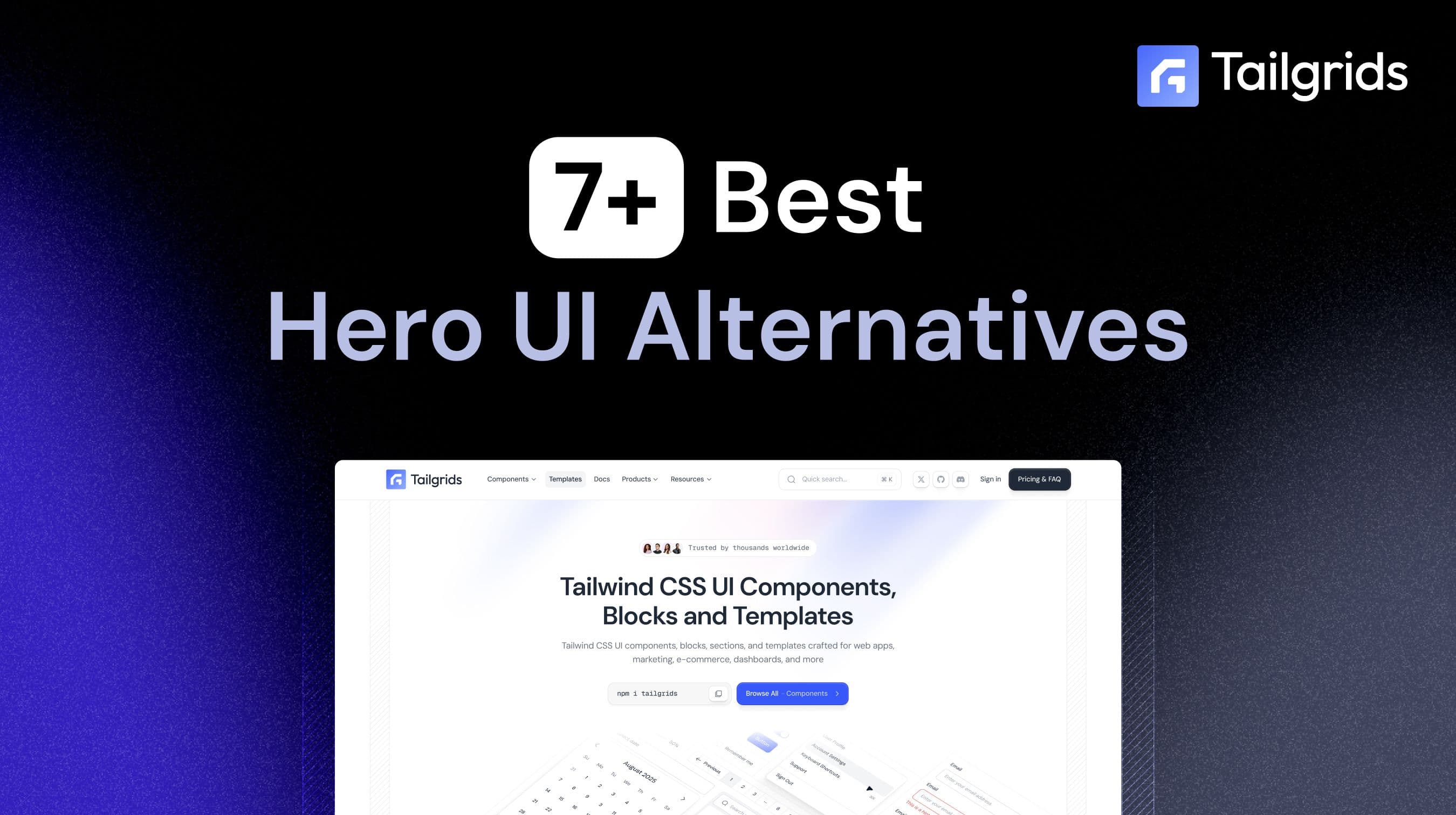
Tailgrids UI
Tailgrids UI is a modern React component library. It is one of the best Hero UI alternatives. The library offers full flexibility and scalability to developers. In this way, it helps to build modern, unique, and complex applications. Moreover, Tailgrids has 600+ pre-built UI components for React projects. You will also get 100+ free components for easy development. The components are built on Tailwind CSS and React.

Together with that, Tailgrids UI offers full code ownership, unlike Hero UI. You will get full control over styling and customization. So developers can easily build a complex, unique brand experience. Furthermore, the UI library provides 900+ Figma UI design components. Thus, designers and developers can customize the component before adding into any project. Tailgrids offers different dashboard templates and other pages as well. It speeds up your development and makes the experience smoother.
Key Features
- 600+ pre-built React UI components
- 100+ free components available
- Built with Tailwind CSS and React
- Full code ownership and customization control
- 900+ Figma UI design components
- Pre-made dashboard and page templates
- Responsive and mobile-friendly component design
- Easy integration with React and Next.js projects
- Regular updates and new component additions
- Scalable for both small and enterprise-level applications
Pros
- Complete control over component code and styling
- Large component library reduces development time
- Extensive Figma resources improve designer-developer collaboration
- Tailwind CSS foundation makes customization simple
- Suitable for building unique and branded user experiences
- Includes templates and page sections for faster project setup
- Supports modern React development workflows
Cons
- Requires Tailwind CSS knowledge for advanced customization.
GitHub Stars: 1.6K
GitHub Repo: Tailgrids/tailgrids
Shadcn UI
Shadcn UI is another popular UI component library for developers. It is not a traditional package. Thus, the library allows you to download the components directly. It provides full code ownership to developers. So, you can easily build different, unique applications. Not only that, the UI library has 50+ pre-built reusable components. Another with that, the Hero UI alternative is built on top of Radix UI and Tailwind CSS. Thus, along with full code ownership, you can also customize the components as you want.

You can change the colors, theme, and strokes as you want. Also, the library integrates with React Zod, Hook Form, and TanStack Table. The UI library also supports Remix, React, and Next.js. That’s why most developers now choose it over Hero UI. Even so, some developers get stuck on Shadcn’s AI slop issues and look for other Shadcn alternatives.
Key Features
- Provides full code ownership with copy-and-paste components
- Built on Radix UI and Tailwind CSS
- 50+ reusable UI components
- Extensive customization options for themes, colors, and styling
- Supports modern frameworks like React, Next.js, and Remi
- Integrates with React Hook Form, Zod, and TanStack Table
- Accessible components powered by Radix UI
- CLI for quick component installation and setup
- Has dark mode support
- Offers strong TypeScript support
Pros
- Complete control over component code
- Highly customizable and flexible
- Easy to align with custom design systems
- Integrate with Tailwind CSS perfectly
- Has no dependency on a large UI package
- Offers a strong accessibility foundation
- Has an active community and ecosystem
Cons
- Requires more setup than traditional UI libraries.
- Developers are responsible for maintaining component code.
- Fewer components in the collection than some full-featured UI frameworks.
- Frequent updates can require manual component synchronization.
GitHub Stars: 117K
GitHub Repo: shadcn-ui/ui
Material UI
MUI or Material UI is a comprehensive React component library for SaaS applications and websites. It is also one of the best Hero UI alternatives. It is a fast UI library for React projects. Not only that, the library offers proper flexibility and scalability. Hence, developers can build any small or large React projects without any hassle.

Moreover, the UI library has 40+ building blocks and page templates. So, you can build your React project without working very hard. Together with that, the UI toolkit for React allows you to customize the components and blocks as you want. It also offers 100% ownership of the front-end code. So, you can modify, edit, and distribute as you want. The library also has a huge community support from developers and designers.
Key Features
- Comprehensive React UI component library
- Based on Google's Material Design system
- 40+ UI building blocks and page templates
- Extensive theming and customization options
- Strong TypeScript support
- Responsive components with an accessibility-focused design
- Supports dark mode and custom themes
- Large ecosystem with additional MUI tools and extensions
- Detailed documentation and community resources
Pros
- Provides a large and mature component ecosystem
- Excellent documentation and community support
- Highly scalable for enterprise applications
- Strong accessibility standards
- Flexible theming and customization capabilities
- Reliable TypeScript integration
- Regular updates and long-term maintenance
Cons
- Can increase bundle size in larger projects.
- Material Design styling may require extra customization.
- Advanced customization can become complex.
- Premium components require a paid license.
GitHub Stars: 98.5K
GitHub Repo: mui/material-ui
Chakra UI
Chakra UI is another of the best alternatives to Hero UI. It is also another simple React component library for SaaS developers. The library has 180+ pre-built React components for any project. You can build small to large projects without getting out of the system. Furthermore, the UI library offers better flexibility and accessibility than Hero UI.

Furthermore, Chakra UI has a modular architecture. It means you can only download and install the component you want. You don’t have to install the whole package into your project. Along with extensive customization, the components are also extendable. You can simply add smaller components to build your own custom UI block. Also, the library works well with modern frameworks and has strong TypeScript support.
Key Features
- 180+ pre-built React components
- Modular architecture for selective component installation
- Accessibility-focused UI components
- Extensive theming and customization features
- Strong TypeScript support and comprehensive documentation
- Responsive design for any screen size
- Support dark mode
- Composable and extendable component system
- Works seamlessly with React and Next.js
Pros
- Easy to learn and implement
- Excellent accessibility support
- Highly customizable design system
- A modular approach helps optimize bundle size
- Strong TypeScript integration
- Active community and documentation
- Ideal for SaaS and business applications
Cons
- No full code ownership like shadcn/ui.
- Advanced custom designs may require extra effort.
- Limited built-in complex components.
- Requires theme management for large-scale projects.
GitHub Stars: 40.5K
GitHub Repo: chakra-ui/chakra-ui
Ant Design
Ant Design, also known as AntD, is an enterprise-grade React component library. Developers popularly use it as one of the HeroUI alternatives. It is a strong UI component library and design language. As a result, developers can work on and build complex, data-heavy projects. Moreover, the React UI toolkit includes 60 core components. The UI blocks are pre-built and ready to use in different SaaS or large web applications.

Furthermore, Ant Design components follow the 24-column grid system. Therefore, developers can build better UI design and deliver better UX. Also, the library supports TypeScript and advanced CSS-in-JS theming. It also supports internationalization (i18n) for different languages. You will also get a Figma UI kit to customize the components like a smooth sailing.
Key Features
- 60 core enterprise-ready React components
- 24-column grid system for responsive layouts
- Strong TypeScript support
- More in-depth theming and personalization features
- Internal support for i18n (internationalization) is included as standard.
- Full design system and design guidelines to adhere to.
- A pre-built Figma UI kit designed for designers.
- Form, table, and data visualization components.
- Ideal for large-scale and data-driven applications.
- A wide variety of documentation and ongoing support through frequent releases.
Pros
- Speeds up the development of admin panels and business applications.
- Provides a consistent user experience across large projects.
- Reduces the need for third-party components.
- Best for applications with complex data workflows.
- Backed by a mature and proven ecosystem.
- Offers detailed documentation and implementation examples.
Cons
- Steeper learning curve for beginners.
- Larger bundle size than lightweight alternatives.
- Default Ant Design styling may require customization.
- Can be excessive for small projects.
GitHub Stars: 98.4K
GitHub Repo: ant-design/ant-design
Radix UI
Radix UI is another open-source component library for React applications. It is a headless UI library. So, you can easily customize the components with the style you want. Not only that, but the React UI toolkit also provides full support for Tailwind CSS styling. You will also get better control over custom styling.

Further, Radix UI has 30+ core React components. The components ship without any style. Therefore, you can style the UI blocks as needed for your project. Additionally, the library is well optimized for accessibility, flexibility, and ease of maintenance. You can customize the components however you want. Moreover, the components are easy to use and support dark mode. So, you don’t have to go above and beyond to build modern applications.
Key Features
- Headless and unstyled React components
- 30+ accessible UI primitives
- Full Tailwind CSS compatibility
- Dark mode support
- Keyboard navigation and ARIA compliance
- Composable component architecture
- Lightweight and modular design
- React-focused development experience
- Flexible state management
- Open-source and actively maintained
Pros
- Complete control over styling and design.
- Excellent accessibility standards.
- Lightweight and performance-focused.
- Integrates well with custom design systems.
Cons
- Requires additional styling work.
- Smaller component collection than full UI frameworks.
- Not beginner-friendly for rapid development.
- Often needs other tools to build complete interfaces.
GitHub Stars: 8.5K
GitHub Repo: radix-ui/themes
PrimeReact
PrimeReact is a comprehensive and open-source UI component library for React applications. It is a simple UI library to build easy-to-complex applications. Moreover, the library is created and maintained by PrimeTek Informatics. It includes 80+ reusable, pre-built components and 400+ UI blocks. So, developers can build stunning projects without worrying much about the design.

Additionally, the components are available in both styled and unstyled versions. Thus, you can choose between custom styling and pre-built styling. The UI library also has professionally designed templates for different pages. It provides strong TypeScript support, including type and tooling assistance. You will also get access to the open-source designer and developer community.
Key Features
- 80+ pre-built React UI components
- 400+ ready-made UI blocks
- Styled and unstyled component modes
- Professionally designed application templates and layouts
- Strong TypeScript support with tooling assistance
- Built-in data tables, charts, and form elements
- Multiple themes and design options
- Responsive design support for any device or screen size
Pros
- Speeds up development with ready-made components and templates.
- Offers flexibility with styled and unstyled modes.
- Reduces the need for multiple UI libraries.
- Good for building feature-rich apps quickly.
Cons
- Can feel complex for beginners.
- Requires effort to create a unique custom design.
- Documentation is a bit hard for new users.
GitHub Stars: 8.3K
GitHub Repo: primefaces/primereact
Magic UI
Magic UI is another popular React component library. It is another open-source Hero UI alternative. Like Tailgrids UI, Magic UI also helps both designers and developers. So, it is easy to build stunning applications without going the extra mile. Moreover, the library is built with React, Tailwind CSS, Framer Motion, and TypeScript. That’s why you get 150+ ready-to-use and highly animated components.
Furthermore, the library allows you to copy and paste the component code directly into your project file. So, your project stays lightweight and easy to maintain. Also, you get the full ownership of the code, unlike HeroUI.
Key Features
- 150+ pre-built animated React components
- Built with React, Tailwind CSS, Framer Motion, and TypeScript
- Copy-paste component architecture
- Lightweight, no heavy dependency setup
- Highly interactive and motion-based UI elements
- Full code ownership
- Open-source library
- Easy integration with modern React frameworks
- Focus on modern UI/UX design patterns
- Developer and designer-friendly components
Pros
- Very fast to integrate into React projects.
- Lightweight due to the copy-paste approach.
- Strong focus on animations and a modern UI feel.
- Full control over component code.
Cons
- Limited depth for complex enterprise components.
- Requires manual maintenance of copied components.
- Not ideal for large-scale design systems.
- Smaller ecosystem compared to major UI libraries.
GitHub Stars: 21.3K
GitHub Repo: magicuidesign/magicui
And if you are stuck and want to choose the best alternatives to Mantine UI, we have got your back. Take a look at our Best Mantine UI alternatives list now!
How to Choose the Right Hero UI Alternative
Your project requirements decide which UI library you should choose. Every project has a different need. Therefore, before picking anyone, know your project well first. It will do half of your work. And then, here are some of the factors to look for before choosing a Hero UI alternative:
- Project complexity and use case: If you want to build enterprise-level applications, choose strong UI libraries. For small applications, simple libraries offer better support and a cleaner outcome.
- Dependencies and code ownership: The alternative to Hero UI you choose must offer full code ownership and fewer system dependencies. It will help you work on the project freely.
- Check animations and modern trends: You must also check whether the components follow modern trends. It is crucial to check before making a modern project.
- Flexibility and customization: The UI toolkit for React should also offer greater flexibility and easier customization. Thus, you can build unique brands and design systems.
- Developer experience: You must also consider the developer experience. The HeroUI alternative should have detailed documentation and community support.
Expert Recommendations
Based on component quality, customization, and flexibility, Experts recommend alternatives to Hero UI for specific use cases. Here’s what experts recommend:
- Best Overall Choice: Tailgrids UI
- Best Budget-Friendly Choice: Chakra UI
- Best Tailwind Choice: Shadcn UI
- Best Data-Heavy Applications: Ant Design
- Best Animated UI Choice: Magic UI
- Best All-in-One Component Library: PrimeReact
Final Words
Hero UI alternatives help developers to move beyond design limitations. You don’t have to limit yourself to any design system. You can build whatever you want with a professional design and experience. They help build unique and custom apps with easy maintenance and accessibility.
Every library serves a unique purpose. Some offer pre-built components while others give full control over design. Thus, it’s up to you how much control, speed, and flexibility you want.