Introducing Tailgrids 3.0: The Next Chapter of Developer Experience
TailGrids 3.0 is live. Build faster with a modern React UI component library, TypeScript, CLI tooling, design tokens, and a unified Tailwind UI system.
Vinish Bhaskar
28 Jan 2026
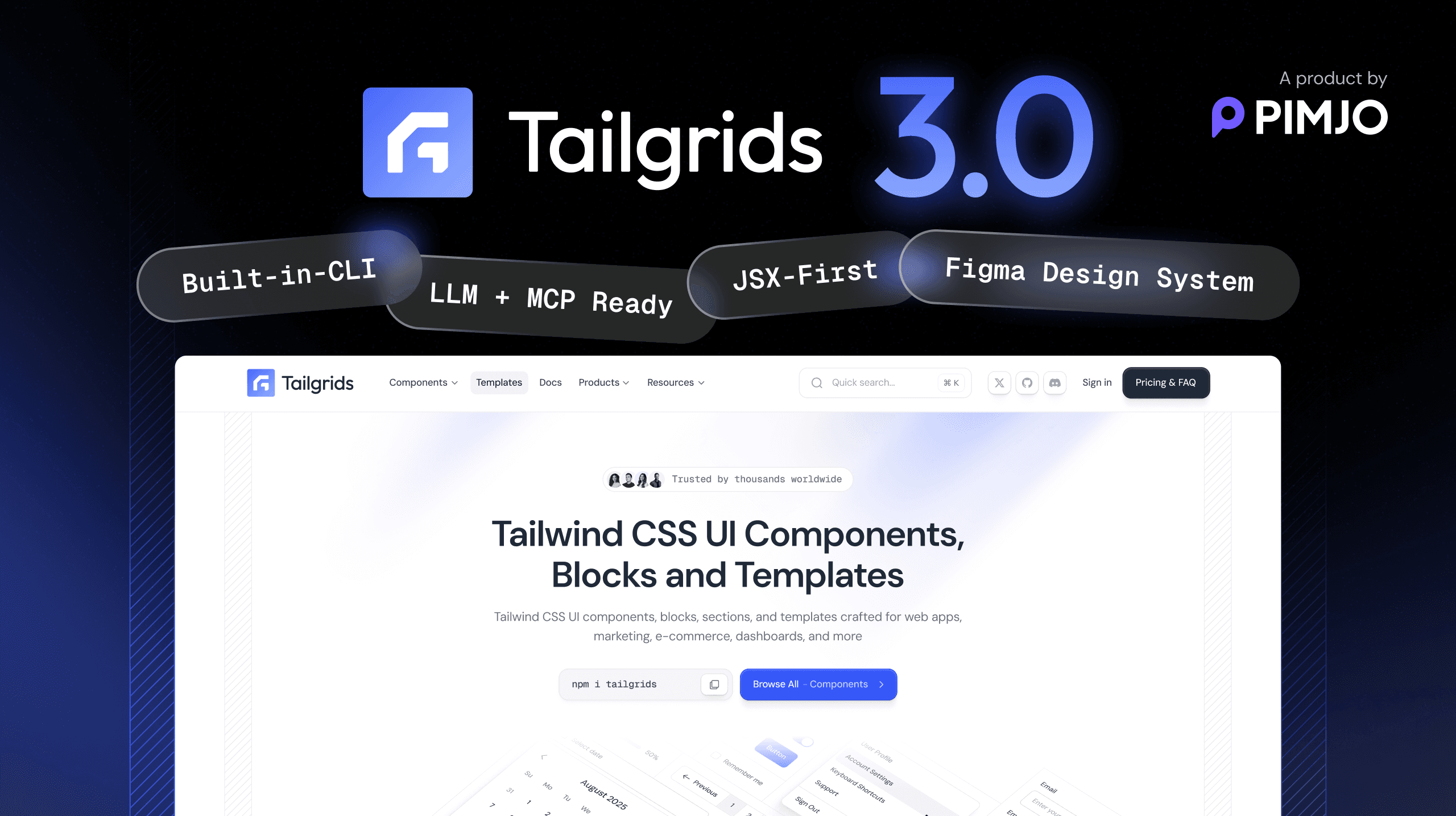
TailGrids 3.0 Is Here
A modern React UI component library, DX-focused and built for modern design.
Built quietly over months, with intent and precision.
Designed to redefine how developers build with TailGrids.
TailGrids 3.0 is not just a new release.
It reflects everything we have learned from building with Tailwind and supporting thousands of developers worldwide.
We took the simplicity developers trusted in TailGrids and rebuilt it for the modern development landscape.
Faster. Modular. React-first. Designed for modern workflows and frameworks.
Why TailGrids 3.0 Exists

TailGrids started with a simple goal: to make Tailwind UI components accessible, consistent, and easy to use.
For years, it helped developers build cleaner interfaces in less time.
But the way products are built has changed.
Frameworks evolve faster. Teams work across multiple stacks. Developers want more control, automation, and flexibility.
We realized that the next generation of TailGrids needed to go beyond pre-built components.
It needed to become a system that aligns with how developers design, build, and scale products.
“This release focuses on one goal: engineering an intelligent, flexible, and scalable developer experience that fits modern workflows.”
Feature Overview

TailGrids 3.0 is the most significant step forward in our journey.
Every improvement, from architecture to aesthetics, was built around one goal: to create a developer experience that feels powerful, predictable, and effortless.
- TypeScript-first React component architecture
- CLI for instant component installation
- Full theme and design token control
- Open-source MDX docs with interactive previews
- Tailwind plugin for global consistency
- Pro Blocks and Templates for production use
- Free, open-source SVG icons Library
- Components and blocks for AI products
- Redesigned site UI and UX
- Built-in ESLint, Prettier, Husky, Storybook, and Playwright
- Unified Free and Pro ecosystem
- Figma design kit synchronization
- Improved docs portal with contributor workflow
- Faster site performance with a more connected ecosystem
Built for speed. Designed for scale. Ready for the future.
Rebuilt for the Modern Stack

This release is a complete rebuild, built on a TypeScript-first foundation and a modern component architecture.
Every component is optimized for performance and designed for modern React workflows.
- Seamless integration with React, Next.js, and more
- Smaller bundle size through tree-shaking
- Design tokens for complete theme control
- One NPM package for easier installation and updates
Getting started is simple. Run this in your project root:
npx @tailgrids/cli@latest initThis sets up Tailgrids, creates the config and base styles, and installs required dependencies.
Add Styles
Copy the contents of tailgrids.css into your main CSS file, like globals.css or app.css.
Add a Component
Add components using the CLI:
npx @tailgrids/cli@latest add buttonUse It
Import and use the component:
import { Button } from "@/components/core/button";

export default function Home() {
  return <Button variant="primary">Hello Tailgrids!</Button>;
}
You can start building in seconds. No conversion. No refactoring. No complexity.
Add Components Instantly
The new version introduces a CLI that installs components directly into your project.
npx @tailgrids/cli@latest add calenderThe CLI automatically configures imports, file structure, and theme settings.
This eliminates the copy-paste workflow that slows developers down.
You stay focused on building instead of setting up.
It feels natural. It feels modern. It feels built for developers.
A Unified Ecosystem for Developers

It brings everything under one clean, unified system.
- Free Components are open-source and welcome community contributions.
- Pro Blocks are crafted for real-world applications such as dashboards, SaaS products, and marketing websites.
Both share the same foundation and design system.
You can test every Pro demo live before purchase, and Pro users can unlock the full React and Tailwind source code.
It is one ecosystem built for every type of project.
Enhanced Design

The TailGrids site has been refreshed for version 3.0. It is faster, cleaner, and easier to explore.
Every page, from documentation to blocks to templates, now follows a more consistent visual system that feels focused and cohesive.
Navigation is smoother, previews load quicker, and everything feels connected.
- Modern layout with improved hierarchy and spacing
- A lighter, sharper, and more usable overall experience
- Faster performance across all pages
- Unified design system for visual consistency
- Smarter navigation and upgraded global search
- Enhanced docs portal, account pages, and icons section
- Better visibility into templates, components, and roadmap updates
The new site is built for clarity and speed. Simple, focused, and developer-friendly.
Rebuilt Components

Components have been rebuilt with a TypeScript-first React architecture and Tailwind design tokens for better control and a better developer experience.
Each component now includes multiple states, responsive behavior, accessibility notes, and usage guidance.
Components now include:
- Responsive variants and multiple states
- Clear usage notes and accessibility guidance
- CLI Support for quick installation
- Live previews for each component and block
- Ready-to-copy React and Tailwind code
- Clean, standardized component APIs
- Theme-aware tokens for complete control
- Improved consistency across all component categories
You can explore, preview, and copy every component directly from the documentation portal.
More Detailed Templates

Templates are now richer and more complete.
8+ modern React templates include multi-page structures for real products such as SaaS dashboards, marketing sites, and admin panels.
Templates now include:
- Complete multi-page structures
- Modern layouts for production apps
- Improved responsive behavior
- Cleaner, scalable file architecture
- Theme-ready styling using design tokens
- Live previews in the new docs portal
- Matching Figma support for visual parity
You can explore each template, preview every page, customize it, and integrate it instantly.
This update adds more detail, context, and flexibility to every template.
Icons Library

The new version introduces a dedicated Icons Library built for speed and precision.
It includes free, open-source SVG icons compatible with TailGrids, Tailwind CSS, React (JSX), and Figma. Each icon is optimized for clarity and consistency across design and code.
You can search, filter, adjust color and size, and copy SVG or React (JSX) instantly.
- Free, open-source SVG icons
- Search and filter by name or category
- Live color and size controls
- One-click copy for SVG and JSX
- Figma-ready assets
- Optimized for TailGrids and Tailwind projects
Fast, consistent, and production-ready.
Figma Design System

The new TailGrids Figma UI Kit and Design System brings full visual parity.
Every component, token, and variant is rebuilt for modern workflows using Auto Layout 5.0, variables, and smart components.
It is fast to explore, easy to extend, and designed for professional product teams.
The system includes:
- Auto Layout 5.0 across all components
- 500+ ready-to-use widgets and examples
- 2,800+ component variants built for flexibility
- 900+ styles, variables, and tokens
- Light and Dark mode powered by Figma variables
- Precise typography system with scalable text styles
- Extensive color palette with 253+ shades and Tailwind-compatible tokens
- Consistent shadows, blurs, and effects
- Responsive layouts for mobile and desktop
- Blocks for dashboards, marketing, eCommerce, and AI applications
Everything in the Figma kit mirrors the TailGrids codebase.
Designers and developers stay aligned while building at speed.
Preview any component, inspect tokens, toggle themes, and hand off cleanly to engineering with no friction.
The Figma Design System is built for teams that value accuracy, consistency, and scalable design workflows.
Built to Fit the Way You Work
TailGrids 3.0 gives developers complete control through design tokens.
Every visual element is customizable:
- Color palettes
- Typography
- Spacing
- Border radius
- Theme modes
You can match the brand instantly or extend it into your own design system.
This flexibility makes TailGrids 3.0 suitable for startups, agencies, and large teams that need precision in design without losing speed.
Documentation That Works With You

Documentation should move as fast as you code.
We rebuilt it from the ground up to be interactive, searchable, and built for collaboration.
Powered by Next.js and MDX, the documentation balances performance with simplicity and is fully open source, including all core component documentation.
Navigation is cleaner, content is structured, and every section is easier to explore.
The new documentation includes:
- Live code previews
- Clear sections for components, blocks, and templates
- Step-by-step framework guides
- Searchable content
- Light and dark mode
- Open-source, Markdown-based editing for contributors
All core component documentation and guides are open source, allowing developers to review, improve, and contribute directly. Every pull request generates a live preview.
This is documentation that evolves with the product, not after it.
Plugin Architecture for Global Consistency
TailGrids 3.0 introduces a new Tailwind plugin system that lets you register components globally.
You can integrate components, themes, and tokens into the Tailwind configuration.
This ensures that the design language stays consistent across every project.
The plugin architecture is flexible, allowing teams to extend or override settings based on project needs.
It is clean, modular, and easy to scale.
Prepared for What’s Next
This release is not just about what’s available today. It lays the foundation for what comes next.
Scalable, adaptable, and aligned with modern frontend workflows.
TailGrids is moving toward intelligent, AI-assisted UI development.
Imagine typing, “Create a pricing section with three tiers and a toggle for monthly and yearly,” and having a ready-to-use React component generated instantly.
That is the future TailGrids is evolving toward.
The new AI layer will:
- Generate React components aligned with TailGrids
- Adapt themes and styles automatically using design tokens
- Connect with local or cloud-based LLMs through the MCP protocol
- Enable faster, context-aware UI creation directly inside your project
This is the beginning of a smarter workflow where TailGrids understands intent and builds instantly.
Engineered for Developers and Teams
It keeps every package in sync, including components, CLI, docs, and adapters.
We use:
- ESLint and Prettier for consistent code
- Husky for quality control
- Storybook for visual testing
- Playwright for regression coverage
Every update follows a contributor-friendly workflow that encourages community participation.
TailGrids 3.0 is built for open collaboration and professional scalability.
Roadmap
With the complete foundation in place, here’s how we’re rolling out TailGrids 3.0 step by step.
- v3.0: TypeScript-first React components, CLI, documentation, Pro Blocks, and templates
- v3.1: Plugin enhancements and expanded Pro Blocks
- v3.2: Framework adapters
- v3.3: AI workflows and design sync
Each phase strengthens developer experience and deepens ecosystem integration.
Our Vision
TailGrids 3.0 is more than a new version. It is a new standard for developer experience.
We kept what developers loved: clean design, consistency, and simplicity.
Then we expanded it with the tools that modern workflows demand: CLI automation, TypeScript safety, framework support, and AI preparation.
This is not about offering more components.
It is about offering a better foundation for how developers build, scale, and collaborate.
“TailGrids 3.0 is built as a Tailwind-based React UI component library for modern frameworks.”
What’s Next
TailGrids 3.0 is live, and development continues.
The current release includes TypeScript-first React components, the CLI, documentation, Pro Blocks, and templates.
Upcoming updates will include:
- Expanded Pro Blocks and templates
- Plugin system enhancements
- Framework adapters
- AI-assisted UI workflows and design sync
These updates are actively in development and will roll out incrementally.
TailGrids 3.0 represents the future of UI development with Tailwind, fast, flexible, and intelligent.
The wait is over.
The next chapter of developer experience begins with TailGrids 3.0.
Explore, install, and start building.
TailGrids 3.0. Designed to evolve. Built for Developers.