The Ultimate Figma  UI Kit and Design System
A complete Figma UI kit for modern product teams - 900+ reusable UI components and variants. Built as a unified component library for consistent, scalable interfaces and seamless design-to-development workflow
Trusted by 150,000+ devs, designers, and teams worldwide.
A Scalable Foundation to Kickstart Any Project
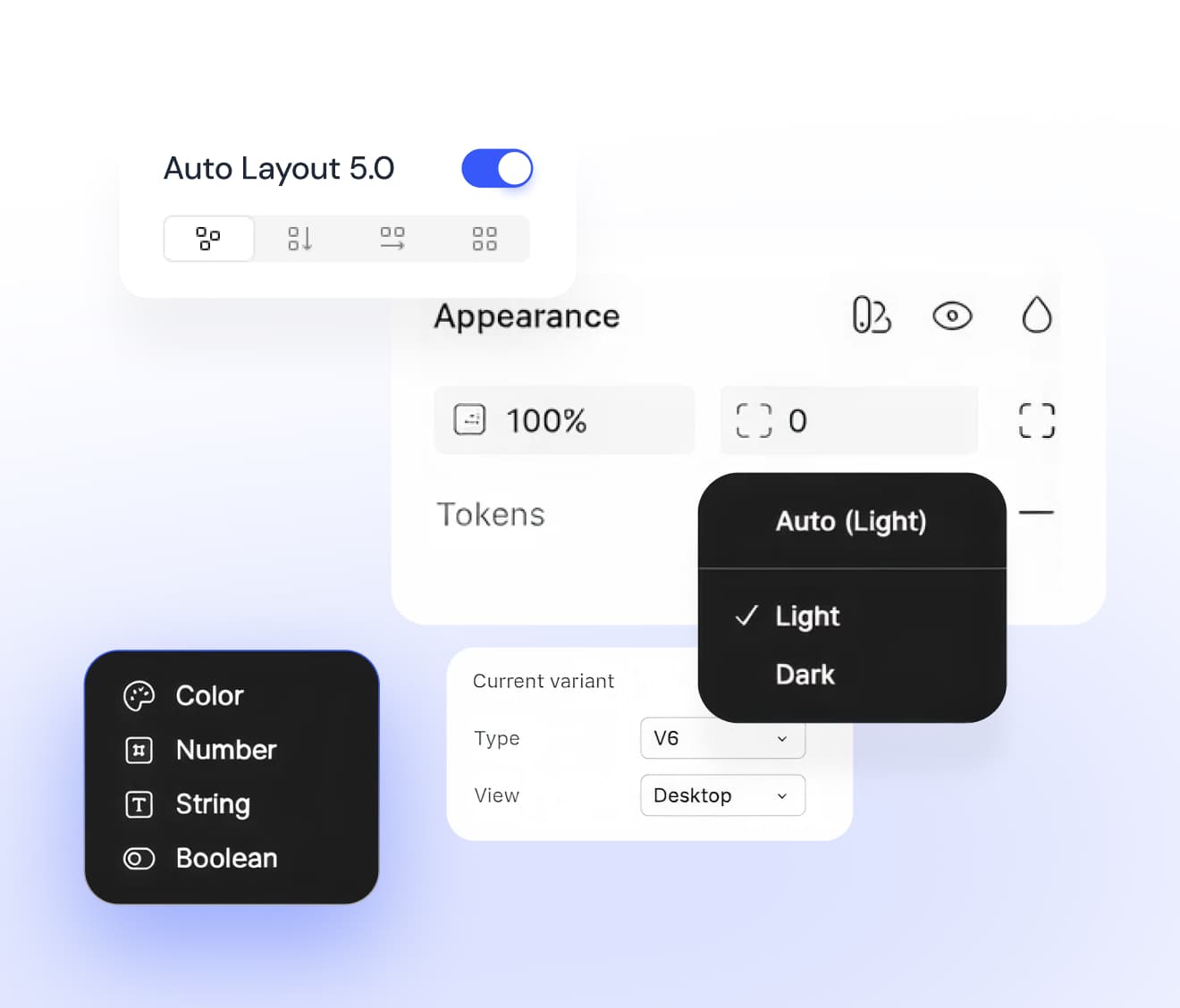
A comprehensive Figma UI kit designed with Auto Layout 5.0, smart variants, shared variables, and built-in WCAG accessibility to support scalable interface design from day one.

600+
600+ Widgets & Examples
Explore a curated set of ready-to-use widgets and examples, designed to accelerate layouts and streamline everyday design workflows.
2,800+
2,800+ Components & Variants
A comprehensive set of flexible UI components and variants built for faster iteration and consistent interface design.
900+
900+ Styles, Variables, & Tokens
Access well-organized styles, variables, and design tokens that maintain visual consistency and scalable theming across projects.
A Figma UI Kit for Consistent, Scalable Interfaces
Smart components and design tokens work together to support real-time collaboration and unified UI across teams and products.
Powered by Figma’s Latest Capabilities
Designed using Figma’s latest capabilities to support faster workflows and scalable interface design.
Fully compatible with Auto Layout 5.0 across pages, components, and UI kits.
Switch between Light and Dark modes using Figma variables across every UI component and block.
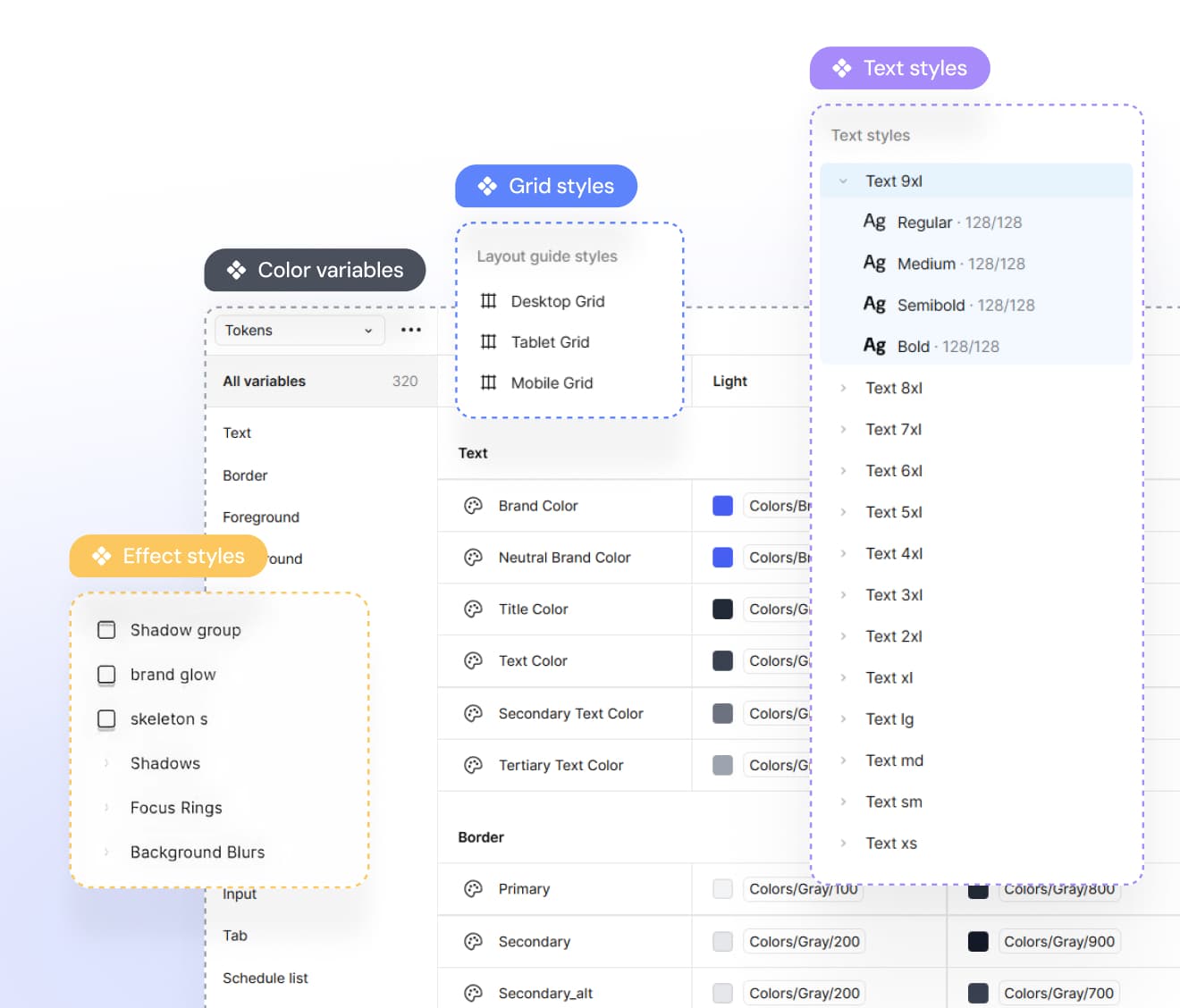
Style Customization Made Simple
Precise and scalable typography system, managed through Figma variables and adjustable instantly from the Variables panel.
Vibrant color palette with 253+ predefined colors, extended shades, and variables aligned with Tailwind CSS
Consistent shadow and blur styles designed to maintain visual clarity and uniformity across all designs.
Production-Ready Components and UI Blocks
Includes structured, consistent UI components built for applications, marketing sites, eCommerce, dashboards, and AI products.
Designed with responsive layouts to ensure reliable behavior across mobile and desktop screens.
Incorporates predefined interactive states, such as hover and active, to support realistic prototyping and smoother handoff.
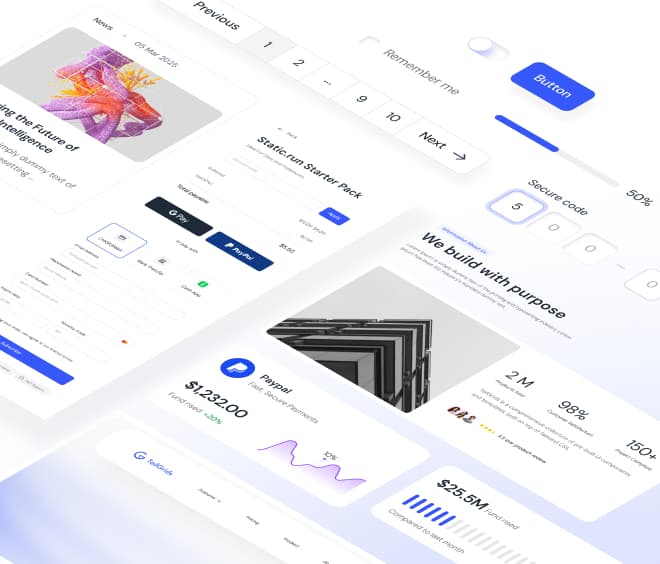
900+ Figma UI Components and Variants
Each component is built with Auto Layout 5.0, structured variants, and shared tokens to ensure consistent and scalable interfaces across Figma projects.


Beautiful Figma Templates Built for Real Products
Design faster with production-ready Figma templates and UI kits, crafted for real product workflows and reusable layout patterns.

NexStudio - React Agency Website Template
React agency website template for digital studios and product teams. Includes services, projects, testimonials, and blog pages. Built with Tailwind CSS.

Fincash - React Fintech Website Templates for Finance Apps
Finance website template built with React for fintech apps. Includes features, pricing, testimonials, Contact and FAQs. Designed for payments and money management platforms.

WriteMate AI - React AI Website Template for Multi-LLM Content Platforms
React AI website template for AI writing tools, content, and chatbot platforms. Includes features, pricing, docs, support, Use Cases, and testimonials sections.
Designers and Teams Building Figma Design Systems
Trusted by designers, product teams, and companies who build and scale consistent interfaces with Tailgrids UI Figma.
Fajar Siddiq
UI/UX Designer, Singapore
Marko Denic
Senior Product Designer
Athar Ahmed
Design System Lead
Ostap Brehin
Freelance Designer
Arnob Mukherjee
Startup Founder
Kamal Hosen
Design Team Lead
Tailgrids Community
Join our Discord to stay up to date with the latest updates, releases, and offers.