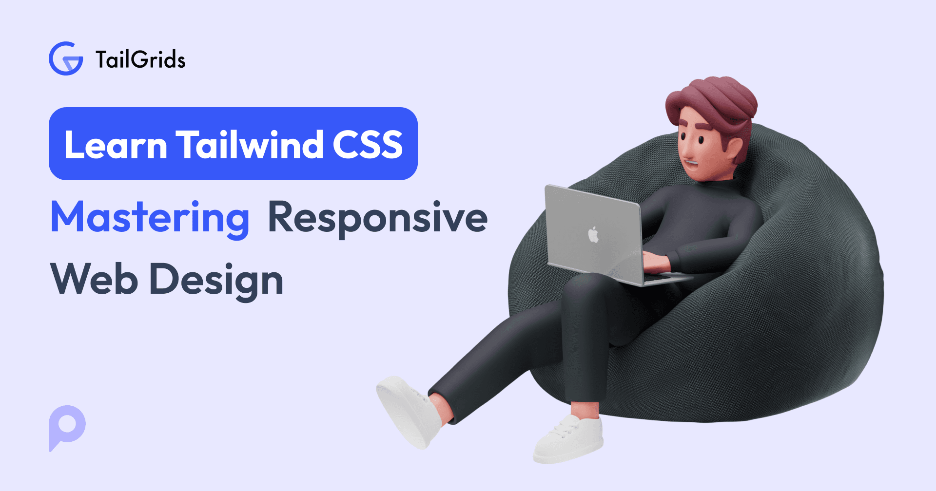
Master Responsive Design with Tailwind CSS Utility Classes
Learn how to create responsive layouts using Tailwind CSS utility classes. Explore breakpoints and examples to build stunning designs for any device.
Vinish Bhaskar
27 Jan 2026
Welcome to the third chapter of our “Learn Tailwind CSS with Examples” tutorial series! In this article, we will explore the usage of responsive utility classes with examples. We'll learn to create responsive Tailwind Components that adapt seamlessly across devices.
By the end of this tutorial, you'll understand how to use Tailwind CSS's responsive utility classes to create a visually appealing and responsive web page for different devices. Additionally, we'll apply our knowledge to develop a visually appealing and user-friendly webpage that provides a seamless experience across various screen sizes and devices.
So, let's explore responsive utility classes and create a responsive design for a seamless multi-device experience with Tailwind CSS!
What is responsive design?
Responsive design is an approach that allows webpages and applications to adapt their layouts and content to the device and screen size. It ensures that the content looks great and functions smoothly, regardless of whether someone is using a desktop, laptop, tablet, or smartphone.
To get started with responsive design, it's important to understand a few key points:
- Grids: Responsive design uses flexible grid systems that allow content to adjust proportionally across different screen sizes. Instead of fixed pixel values, Tailwind uses utility classes to create layouts that scale and adapt to different devices.
- Flexible Images and Media: Images and media elements must be resized and scaled to fit different screen sizes. In Tailwind CSS, we use utility classes like w-full and h-auto to ensure images and media elements resize and scale appropriately across different screen sizes.
- Media Queries: CSS rules that apply specific styles based on a device's characteristics, such as screen size, resolution, and orientation. By using media queries, we can customize the layout and design elements. Tailwind CSS also supports media queries to apply specific styles based on the user's device characteristics.
Responsive design involves creating layouts and user interfaces that smoothly adjust and optimize their appearance based on the user's device and screen size, providing a better viewing and browsing experience.
Benefits of using Tailwind CSS for responsive design
Tailwind CSS is a powerful and user-friendly CSS framework that offers numerous benefits for creating responsive designs:
- Responsive Utility Classes: Tailwind CSS provides an extensive set of responsive utility classes to quickly build a responsive layout.
- Mobile-First Approach: Default styles and utility classes prioritize mobile devices, starting with a mobile-friendly layout and further enhancing it for larger screens.
- Rapid Development: We can rapidly develop responsive designs. The utility classes provide a quick, easy way to modify the appearance and layout of elements.
- Consistency and Maintainability: Tailwind CSS provides a consistent, maintainable codebase through a utility-first approach. The predefined utility classes make it easier to maintain consistent styles and layouts throughout the project.
- Flexibility: In Tailwind CSS, we can easily customize the default configuration, including breakpoints and other design variables, to enhance the framework to meet our specific project requirements.
Responsive Utility Classes
Tailwind CSS provides ready-to-use utility classes to quickly build responsive designs. It simplifies responsive layout creation by eliminating the need to write custom CSS.
It provides a wide range of responsive utility classes that let us create designs that adapt to different screen sizes.
Here are some of the key responsive utility classes in Tailwind CSS (We will discuss some of them in detail) :
Visibility Classes:
- hidden: Hides an element on all screen sizes.
- block: Shows an element as a block on all screen sizes.
- inline: Shows an element as an inline element on all screen sizes.
- flex: Shows an element as a flex container on all screen sizes.
- grid: Shows an element as a grid container on all screen sizes.
Breakpoint-Specific Display Classes:
- sm:block: Displays an element as a block on small and large screens.
- md:inline: Shows an element as an inline element on medium screens and larger.
- lg:flex: Shows an element as a flex container on large screens and larger.
- xl:grid: Shows an element as a grid container on extra-large screens and larger.
Text Size Classes:
- text-sm: Sets the font size to small.
- text-base: Sets the font size to the base size.
- text-lg: Sets the font size to large.
- text-xl: Sets the font size to extra-large.
- text-2xl: Sets the font size to twice the base size.
Width and Height Classes:
- w-full: Sets the width of an element to 100%.
- h-auto: Maintains the aspect ratio of an element.
- w-{size}: Sets the width of an element to a specific size (e.g., .w-1/2 sets the width to 50%).
Margin and Padding Classes 📏:
- m-{size}: Sets the margin of an element to a specific size (e.g., .m-4 sets a margin of 1rem).
- p-{size}: Sets the padding of an element to a specific size (e.g., .p-2 sets a padding of 0.5rem).
These are a few examples of the responsive utility classes available in Tailwind CSS. You can combine these classes and customize them further to create responsive designs for different screen sizes. 📱💻🖥️
But before that, let's understand some key concepts for using Tailwind CSS for responsive layout :
Understanding breakpoints and their significance:
Breakpoints in responsive design are specific screen sizes (width & height) at which the layout and appearance of a webpage change. It is a point at which the design adapts to different screen sizes, enabling optimized viewing and a better user experience.
In Tailwind CSS, by default, styles are applied to mobile devices first, and then you can use responsive utility classes to modify the styles for larger screen sizes.
Tailwind CSS provides predefined breakpoints that you can use in your projects:
- Small (sm): This breakpoint is typically associated with mobile devices and small screens. It targets devices with a minimum width of 640 pixels.
- Medium (md): The medium breakpoint is commonly used for tablets and devices with larger screens. It applies to devices with a minimum width of 768 pixels.
- Large (lg): The large breakpoint covers desktop and laptop screens. It targets devices with a minimum width of 1024 pixels.
- Extra-large (XL): The extra-large breakpoint is suitable for larger screens, such as high-resolution desktop displays. It applies to devices with a minimum width of 1280 pixels.
By using these breakpoints, you can easily create responsive designs that adjust to different screen sizes and provide a seamless experience across various devices.
Using breakpoints utility classes:
Text: To make text responsive, you can apply utility classes based on breakpoints. You can use text-sm for a screen size of above a width of 640px, text-lg for medium screens, text-xl for large screens, and text-2xl for extra-large screens.
Example:
<p class="text-sm md:text-lg lg:text-xl xl:text-2xl">Responsive text</p>Layout: To create responsive layouts, you can use a combination of utility classes and Flexbox or CSS grid.
For example, you can use the flex class along with breakpoint-specific classes like md:flex-row and lg:flex-col to change the layout direction based on screen size.
Example:
<div class="flex flex-col md:flex-row lg:flex-col">...</div>Similarly, you can set utility classes for images
<img class="w-16 md:w-32 lg:w-48" src="...">It works for every utility class, which means you can change anything literally at a given breakpoint, even things like background, letter spacing, or cursor styles.
Understanding visibility and its significance:
Tailwind CSS utility classes for visibility let us control element visibility based on screen size or breakpoints. These classes provide a simple way to hide or show content, ensuring a responsive, seamless user experience across devices.
Now let’s explore how to hide and show elements based on screen size:
Using 'hidden' and 'block' classes:
- The 'hidden' class in Tailwind CSS is used to hide an element by setting its display property to 'none',
- The 'block' class sets an element's display property to 'block'.
Example:
<div class="hidden md:block"> This content is hidden on small screens and visible from medium screens onwards. </div>In this example, we're using the hidden class along with the breakpoint-specific class md: block. The hidden class hides the element on all screen sizes except those with a width less than 640px, while the md:block class overrides the hidden class and makes the element visible on medium screens (md) and larger.
Here are some examples of hiding or showing content for specific breakpoints using Tailwind CSS:
a. Hiding content on small screens: To hide content on small screens (up to the medium breakpoint), you can use the 'hidden' class with the 'sm' breakpoint.
Example:
<p class="hidden sm:block">Content is hidden on small screens.</p>b. Showing content on only large screens: To show content only on large screens (from the large breakpoint onwards), you can use the 'block' class with the 'lg' breakpoint.
Example:
<p class="hidden lg:block">This content is hidden on small and medium screens but visible on large screens.</p>c. Hiding content on extra-large screens: To hide content on extra-large screens (from the extra-large breakpoint onwards), you can use the 'hidden' class with the 'xl' breakpoint.
Example:
<p class="hidden xl:block">This content is hidden on small, medium, and large screens but visible on extra-large screens.</p>By using the visibility utility classes, you can easily control element visibility at specific breakpoints, ensuring a responsive, optimized experience across devices.
Remember to test your design on various devices and screen sizes to ensure the visibility classes are applied correctly and the content appears as required.
Creating a responsive layout for different devices
In the above section, we learned the principles of responsive design and gained an understanding of the use of Tailwind CSS's responsive utility classes. Now, it's time to put that concept into action.
In this next step, we will make our previously created Portfolio page responsive. If you haven't gone through the chapter on creating a simple portfolio page, I recommend that you go through it for a better understanding.
To make our portfolio responsive to different devices and screen sizes, we will utilize the responsive utility classes we have learned so far...
Please follow the steps below to make it responsive:
Here is the code of a simple portfolio component from our previous chapter (Basic Usage and Utility Classes) of the tutorial series “Learning Tailwind CSS with examples”:
Previous Code:
<!DOCTYPE html>
<html lang="en">
<head>
    <meta charset="UTF-8">
    <meta http-equiv="X-UA-Compatible" content="IE=edge">
    <meta name="viewport" content="width=device-width, initial-scale=1.0">

    <link rel="stylesheet" href="./style.css" class="">
    <title>Simple Portfolio Page</title>

</head>
<body class="bg-slate-950">
    <!-- Nav bar start here -->
    <nav class="bg-purple-700 text-white py-4">
        <div class="container mx-auto flex items-center justify-between">
          <div class="flex items-center">
            <img class="rounded-full h-12 w-12 mr-2" src="https://cdn.pixabay.com/photo/2014/04/02/17/07/user-307993_1280.png" alt="Profile Image">
            <h1 class="text-2xl font-bold">Sophia Johnson</h1>
          </div>
          <ul class="flex space-x-8">
            <li><a href="#" class="text-xl font-semibold hover:underline">About Me</a></li>
            <li><a href="#" class="text-xl font-semibold hover:underline">Projects</a></li>
            <li><a href="#" class="text-xl font-semibold hover:underline">Resume</a></li>
            <li><a href="#" class="text-xl font-semibold hover:underline">Contact</a></li>
          </ul>
        </div>
      </nav>
    <!-- Nav Bar Ends here -->

    <!-- main content area start here -->
    <div class="container mx-auto mt-8 flex items-center justify-center">
        <div class="text-white mt-8">
          <p class="text-8xl font-bold">I am</p>
          <p class="text-4xl font-semibold text-yellow-400 mt-4">Passionate Web Developer</p>
          <div class="w-36 h-2 border-b-4 border-purple-600 mt-2 mb-4"></div>
          <p class="text-2xl text-gray-400 mt-8">I am a passionate Web Developer with over 5 years of experience in creating compelling visual designs.</p>
        </div>
        <!-- image div start -->
        <div>
            <img class="max-w-2xl h-auto" src="https://i.ibb.co/z8kWxyL/pexels-andrea-piacquadio-3979198-removebg-preview.png" alt="Image">
        </div>
        <!-- image div end -->
      </div>
    <!-- main content area end here -->

</body>
</html>
Make the Navigation Bar Responsive:
Firstly, modify the navigation bar code to adjust its layout and visibility on different screen sizes. Add classes and styles to achieve a responsive navigation bar. Here are the steps:
a. Set the navigation bar to span the full width of the screen on all devices by adding the class w-full to the <nav> element.
<nav class="w-full px-8 bg-purple-700 text-white py-4">b. Adjust the size of the profile image in the navigation bar to maintain its proportions on different screen sizes. Use the classes h-8 w-8 mr-2 md:h-12 md:w-12 for the <img> element.
<img class="rounded-full h-8 w-8 mr-2 md:h-12 md:w-12" src="https://cdn.pixabay.com/photo/2014/04/02/17/07/user-307993_1280.png" alt="Profile Image">
c. Make the navigation menu items responsive by adding the classes md:flex space-x-8 hidden to the <ul> element. This ensures the menu items are displayed in a row on medium-sized screens and hidden on smaller screens.
<ul class="md:flex space-x-8 hidden text-xl font-semibold">
d. Create a div for a responsive menu icon (hamburger) for small screens with the class md:hidden. This will display the menu icon only on small screens.
<div class="md:hidden">
<a class="text-4xl font-semibold" href="#">≡</a>
</div>Create a Responsive Main Content Area:
Adjust the main content area to change vertically on small screens and align it in a row on medium-sized screens. Follow these steps:
a. Use the classes flex flex-col md:flex-row for the <div> element containing the main content area. This will show the content vertically on small screens and align it in a row on medium-sized screens.
<div class="container mx-auto mt-8 flex flex-col md:flex-row items-center justify-center">
b. Adjust the margin on the left and right sides of the text container to create spacing between the content and the edges of the screen. Add the classes mx-4 md:mx-8 to the <div> element containing the text.
<div class="text-white mt-8 mx-4 md:mx-8">
c. Make the subheading responsive by adding the classes text-2xl font-bold md:text-4xl md:font-semibold to the <p> element. This increases the font size on medium-sized screens.
<p class="text-2xl font-bold md:text-4xl md:font-semibold text-yellow-400 mt-4">Passionate Web Developer</p>
d. Center align the text on small screens and left align it on medium-sized screens. Use the class text-center md:text-start for the <p> element.
<p class="text-2xl text-gray-400 mt-8 text-center md:text-start">I am a passionate Web Developer with over 5 years of experience in creating compelling visual designs.</p>
Adjust the Image for Responsive Display:
Modify the image to ensure it scales properly on different screen sizes. Here are the steps:
Add the classes w-auto h-100vh -mt-20 justify-center md:max-w-2xl md:mt-0 md:h-auto to the <img> element. This adjusts the width, height, and positioning of the image to make it responsive.
- The class w-auto allows the image to adjust its width while maintaining its aspect ratio.
- The class h-100vh sets the height of the image to 100% of the viewport height, ensuring it covers the entire height of the screen on small screens.
- The class -mt-20 adds a negative top margin to position the image higher on the page.
- The class justify-center centres the image horizontally within its container on small screens.
- The classes md:max-w-2xl md:mt-0 md:h-auto limit the image width, reset the top margin, and allow it to adjust its height on medium-sized screens.
<div class="">
            <img class="w-auto h-100vh -mt-20 justify-center  md:max-w-2xl md:mt-0  md:h-auto" src="https://i.ibb.co/z8kWxyL/pexels-andrea-piacquadio-3979198-removebg-preview.png" alt="Image">
</div>
By following the above step-by-step processes and making the specified code changes, we created a responsive design of a portfolio using the responsive utility class of Tailwind CSS.
Please check the code snippet in the playground for a live demonstration and implementation of the code.
Or
Here is the complete code :
<!DOCTYPE html>
<html lang="en">
<head>
<meta charset="UTF-8">
<meta http-equiv="X-UA-Compatible" content="IE=edge">
<meta name="viewport" content="width=device-width, initial-scale=1.0">
<link rel="stylesheet" href="./style.css" class="">
<title>Simple Portfolio Page</title>
</head>
<body class="bg-slate-950">
<!-- Nav bar start here -->
<nav class="w-full px-8 bg-purple-700 text-white py-4">
<div class="container mx-auto flex items-center justify-between">
<div class="flex items-center">
<img class="rounded-full h-8 w-8 mr-2 md:h-12 md:w-12" src="https://cdn.pixabay.com/photo/2014/04/02/17/07/user-307993_1280.png" alt="Profile Image">
<h1 class="text-2xl font-bold ">Sophia Johnson</h1>
</div>
<ul class="md:flex space-x-8 hidden text-xl font-semibold">
<li><a href="#" class="cursor-pointer hover:underline">About Me</a></li>
<li><a href="#" class="cursor-pointer hover:underline">Projects</a></li>
<li><a href="#" class="cursor-pointer hover:underline">Resume</a></li>
<li><a href="#" class="cursor-pointer hover:underline">Contact</a></li>
</ul>
<div class="md:hidden">
<a class="text-4xl font-semibold" href="#">≡</a>
</div>
</div>
</nav>
<!-- Nav Bar Ends here -->
<!-- main content area start here -->
<div class="container mx-auto mt-8 flex flex-col md:flex-row items-center justify-center">
<div class="text-white mt-8 mx-4 md:mx-8">
<p class="text-8xl font-bold">I am</p>
<p class="text-2xl font-bold md:text-4xl md:font-semibold text-yellow-400 mt-4">Passionate Web Developer</p>
<div class="w-36 h-2 border-b-4 border-purple-600 mt-2 mb-4"></div>
<p class="text-2xl text-gray-400 mt-8 text-center md:text-start">I am a passionate Web Developer with over 5 years of experience in creating compelling visual designs.</p>
</div>
<!-- image div start -->
<div class="">
<img class="w-auto h-100vh -mt-20 justify-center md:max-w-2xl md:mt-0 md:h-auto" src="https://i.ibb.co/z8kWxyL/pexels-andrea-piacquadio-3979198-removebg-preview.png" alt="Image">
</div>
<!-- image div end -->
</div>
<!-- main content area end here -->
</body>
</html>Here is the final view of our responsive design. It demonstrates how our portfolio page adapts and looks visually appealing across different devices and screen sizes.

Conclusion
Throughout this chapter, we have understood the fundamental concepts of responsive utility classes in Tailwind CSS and explored their use to enhance our design. We have also applied these utility classes to create a responsive web page, gaining practical experience along the way.
We started by learning the basic principles of Responsive design, then looked at the benefits of using the Tailwind CSS utility class for Responsive design. After that, we explored the responsive utility class with examples to see how these utility classes work together.
Finally, we started building a responsive layout of our portfolio using what we learned in this tutorial. This will help us practice and apply our new skills to develop a responsive website.
By completing this chapter, you now have a good foundation for creating responsive layouts using Tailwind CSS. You can use responsive utility classes to make your website visually appealing across different devices, and you can extend this to make other pages of your portfolio responsive as well.
Remember to keep practicing and experimenting with Tailwind CSS. The more you work with it, the better you'll become. We hope you enjoyed this tutorial series and wish you much success on your web development journey.
Happy coding!